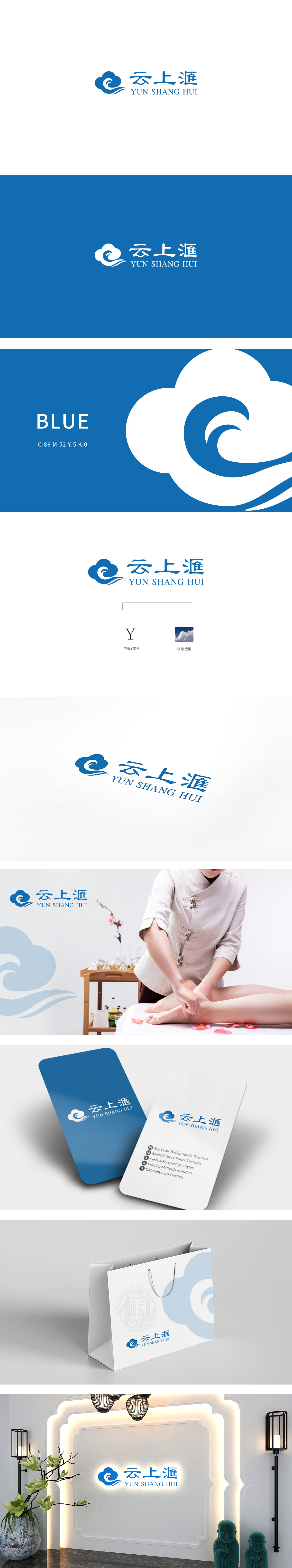
狮动设计通过云的轮廓采用「圆润曲线」,模拟云朵的柔软质感,直接关联「云上汇」的品牌名称,形成「视觉-文字」的强联想;云纹内部融入「波浪+漩涡」元素:波浪象征「水流」,呼应「汇」(聚集、流动)的字义,暗合「养生」的「循环」理念;漩涡的「向心力」则隐喻「吸引」,暗示对客户的「治愈力」——让疲惫的身心「归拢」到放松状态;「云上汇」的LOGO,是「品牌定位」与「视觉设计」的完美融合。
Lion Design adopts a "rounded curve" through the outline of the cloud, which simulates the soft texture of the cloud, directly relates to the brand name of "Meeting on the Cloud" and forms a strong association of "vision-words";The elements of "wave+vortex" are integrated into the moire: the wave symbolizes "water flow", echoes the meaning of "gathering and flowing", and coincides with the concept of "circulation" of "health preservation"; The "centripetal force" of the vortex is a metaphor for "attraction", implying the "healing power" for customers-let the tired body and mind "gather" to a relaxed state.


扫码或拨打添加客服微信


