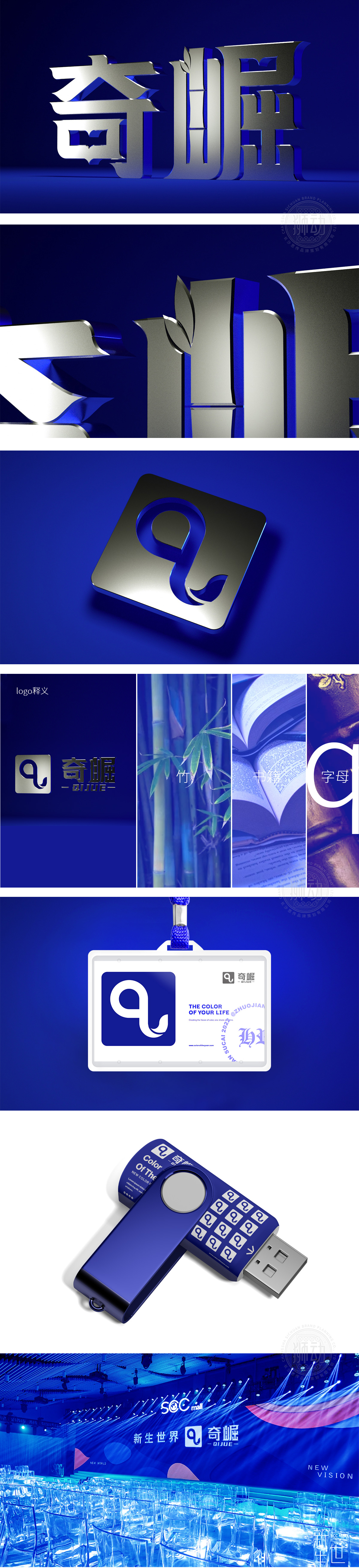
狮动设计采用字母Q变形,象征品牌「不断前进、突破自我」的活力;字体结构方正中带棱角(如「奇」字的「大」部、「崛」字的「山」部),强化了「突出、挺拔」的视觉感受,完美契合「奇崛」(奇特突出)的品牌名称;银灰色:自带金属光泽,既传达「高端、可靠」的品牌形象,又通过「冷色调」强化了「理性、精准」的科技气质;让静态的logo,传递出「跃动的生命力」。
Lion design uses the letter Q to symbolize the brand's vitality of "constantly advancing and breaking through itself"; The font structure is square and angular (such as the "big" part of the word "odd" and the "mountain" part of the word "rise"), which strengthens the visual feeling of "prominence and straightness" and perfectly fits the brand name of "odd rise" (peculiar prominence); Silver-gray: with metallic luster, it not only conveys the brand image of "high-end and reliable".


扫码或拨打添加客服微信


