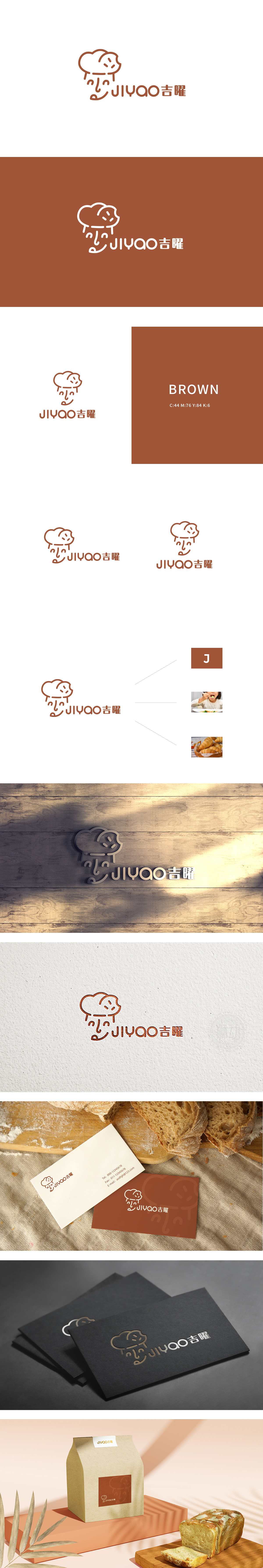
狮动设计由简化的“厨师帽+面包”组合图形构成,线条采用温暖的棕色调,自带烘焙行业的烟火气与食材感:传统厨师帽的尖顶被柔化成蓬松的“面包轮廓”,褶皱线条模拟了面包发酵后的自然膨胀感,帽檐处的短线条更像是面包表面的裂纹或烘焙时的焦痕,让“专业厨师”与“核心产品”(面包)产生了视觉关联,整体线条圆润、流畅,如同揉制面团时的柔和手感,进一步强化了“烘焙”的柔软、温暖属性,精准匹配了烘焙行业的“手工感”“温度感”定位。用一个核心图形(厨师帽=专业,面包=产品,笑脸=情感)讲完整的故事”,同时承载了“行业属性、产品核心、品牌温度”三重信息,且所有元素都服务于“烘焙=温暖、新鲜、愉悦”的认知传递。
Lion design is composed of simplified "chef's hat+bread" combination graphics, with warm earthy tones lines and a sense of fireworks and ingredients in baking industry: the spire of the traditional chef's hat is softened into a fluffy "bread outline", the wrinkled lines simulate the natural swelling feeling of bread after fermentation, and the short lines at the brim of the hat are more like cracks on the surface of bread or scorch marks during baking, which makes "professional chef" and "core product" (bread) The overall lines are round and smooth, just like the soft feel when kneading dough, which further strengthens the softness and warmth of "baking" and accurately matches the positioning of "manual sense" and "temperature sense" in the baking industry.


扫码或拨打添加客服微信


