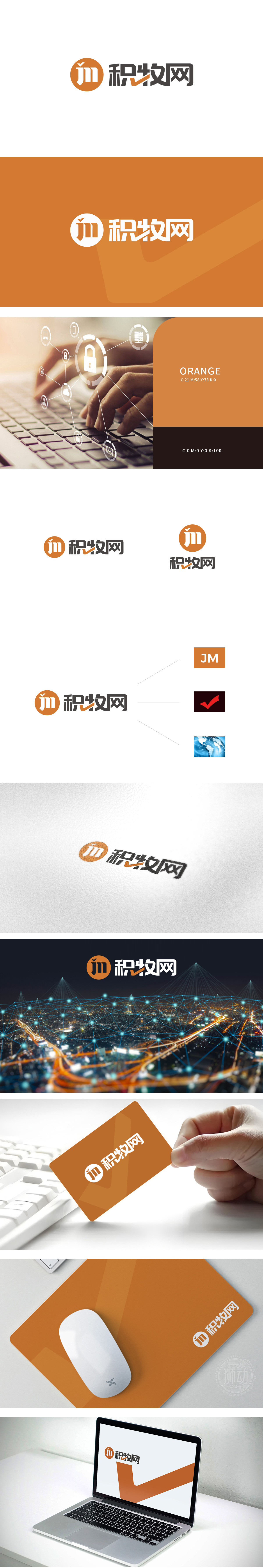
狮动设计从品牌名称中提取“JM”与“勾”状图形,用极简元素承载“可靠、连接、全球化”的多重含义;系统化色彩管理:以橙色为主轴,辅以红、蓝、黑等功能性色彩,构建既有统一性又有场景区分度的视觉体系;互联网思维的场景适配:兼顾多端显示、快速识别、模块化扩展等需求,使设计不仅“好看”,更能“好用”于实际业务场景。
Lion design extracts "JM" and "hook" shapes from the brand name, and carries the multiple meanings of "reliability, connection and globalization" with minimalist elements; Systematic color management: orange as the main axis, supplemented by red, blue, black and other functional colors, to build a visual system with both unity and scene discrimination; Scene adaptation of Internet thinking: Taking into account the requirements of multi-terminal display, rapid identification and modular expansion.


扫码或拨打添加客服微信


