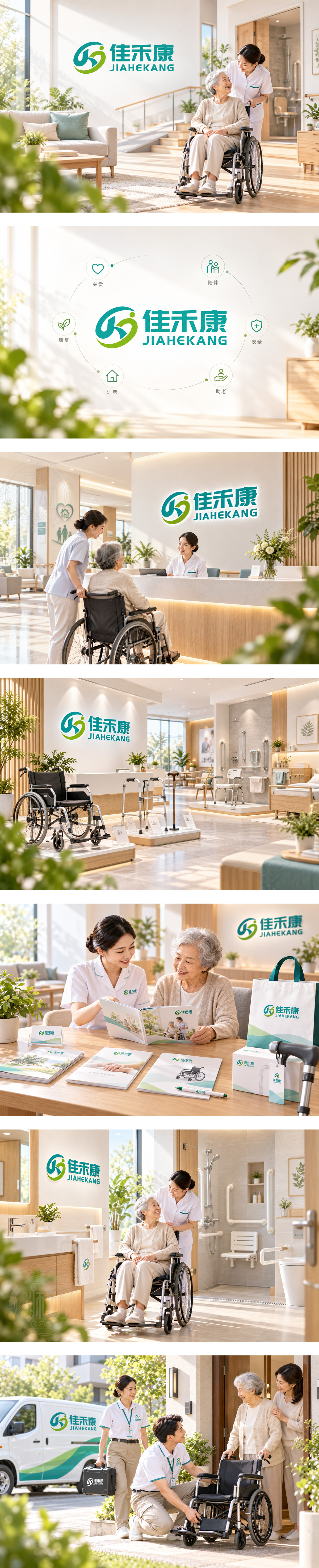
标志以环抱动态勾勒“人”形,青绿与嫩黄交织,如禾苗生长、生命舒展,寓意康复赋能与居家安心。弧线似扶手与步态轨迹,传递辅具支撑及无障碍改造的温柔守护;整体向上跃动,象征出院过渡与高龄生活的自主活力。字形稳重亲和,建立专业、可信赖的健康陪伴形象。
Embracing curves form a human figure in motion, where teal and lime suggest growth, vitality and healing. Fluid lines echo handrails, gait paths and supportive care, expressing assistive equipment and safe home adaptation. The upward rhythm conveys renewed independence for post-discharge and senior living. Steady yet friendly typography builds a trustworthy health-partner identity.




扫码或拨打添加客服微信


