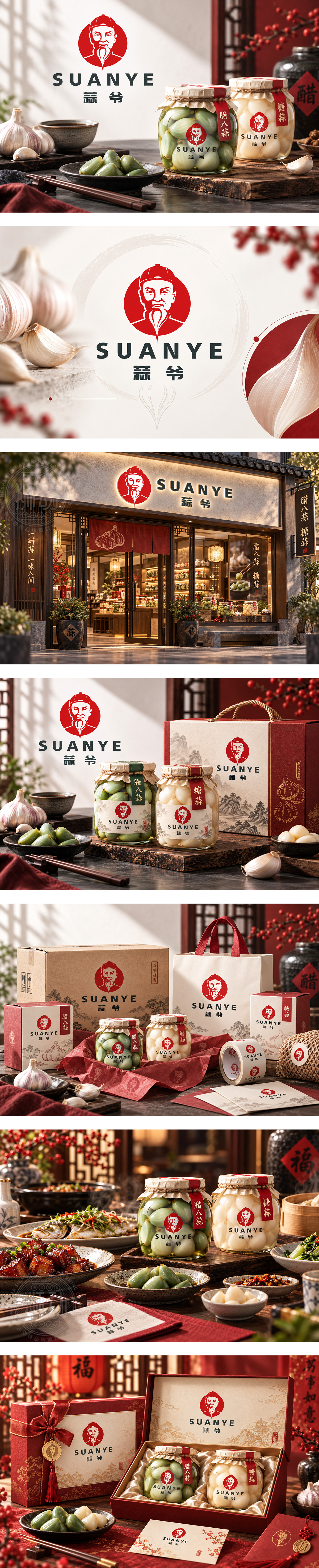
标志以红色圆底衬出“蒜爷”长者肖像,线描慈眉善目、胡须垂落如蒜瓣形态,传递手艺传承与邻家信任感。正红唤起腊八节庆、糖蒜莹润与坛腌火候的记忆;粗粝黑体字稳健有力,强化地标式味觉符号。整体融合市井温度与传统腌渍匠心,建立亲切、地道、有年代感的佐餐品牌识别。
A red disc frames a benevolent elder portrait in crisp line art, his beard echoing garlic cloves and hinting at time-honored pickling craft. Vivid red evokes festive warmth, cured sweetness and traditional jarred flavors, while bold black typography anchors the mark with rustic strength. The identity blends neighborhood hospitality and heritage technique, creating an approachable, authentic condiment brand with lasting sensory appeal.




扫码或拨打添加客服微信


