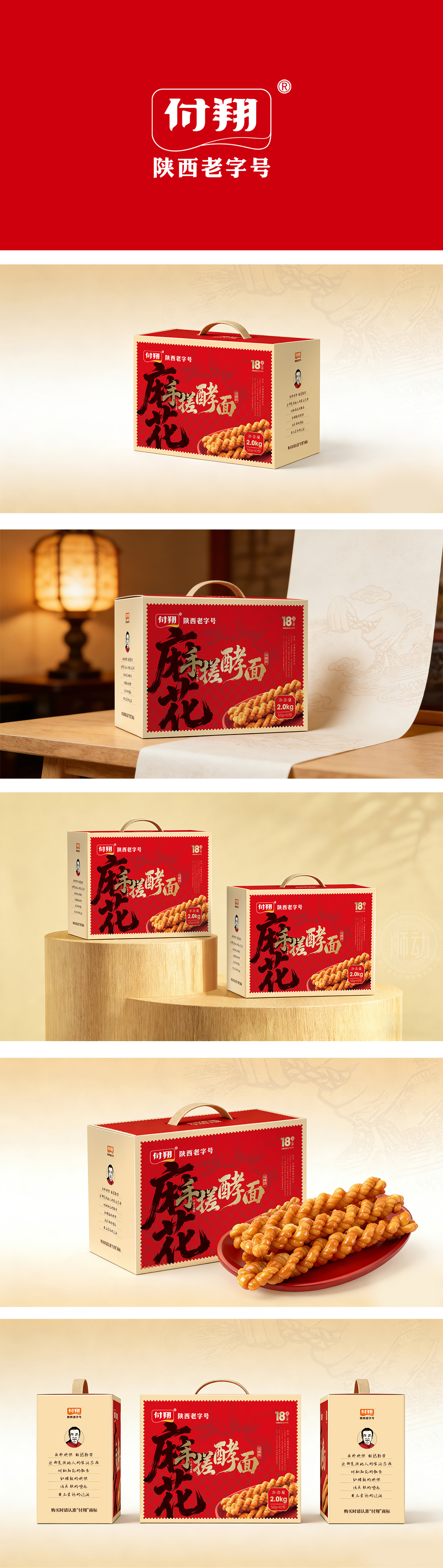
狮动设计采用书法字体,以毛笔的“枯笔”“飞白”效果模拟麻花的“拧劲”,视觉上直接关联“麻花”的产品形态,比照片更有“记忆点”;书法字体下方搭配真实麻花实物图,用“具象化视觉”补足书法的抽象感,让“没见过搓酵面麻花”的消费者也能快速理解产品。“陕西老字号”+“18周年”“觉得靠谱”,人物IP“有温度”;设计的“有效性”——用“看得见的需求”打动消费者,“老字号”的温度感,藏在每一处符号里。
Lion design uses calligraphy font, and simulates the "twisting strength" of the twist with the "dry pen" and "flying white" effect of the brush, which is directly related to the product form of the twist visually and has more "memory points" than the photos; The calligraphy font is matched with a real twist physical diagram, and the abstract feeling of calligraphy is supplemented by "figurative vision", so that consumers who have never seen the twist of dough can quickly understand the product. "Shaanxi time-honored brand"+"18th anniversary" "I feel reliable", and the character IP "has temperature"; The "effectiveness" of design-impress consumers with "visible demand", and the temperature sense of "time-honored brand" is hidden in every symbol.


扫码或拨打添加客服微信


