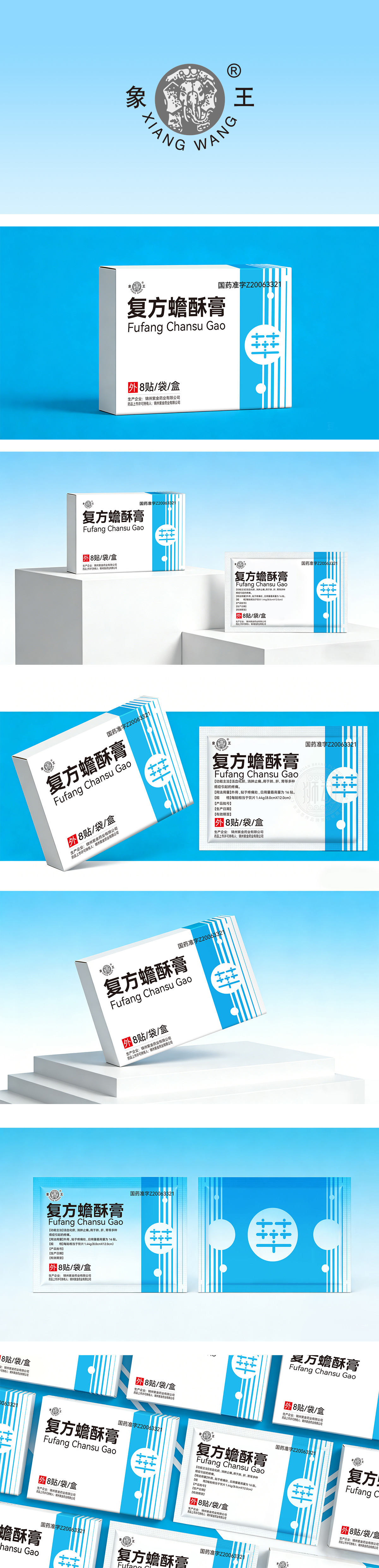
狮动设计采用浅蓝+白的组合,浅蓝:传递“专业、可靠、冷静”的心理感受,契合中药膏剂“温和疗愈”的产品属性;白色:作为底色,强化“干净、安全”的印象,符合外用药品对“卫生”的核心诉求;红色“外”字:用高饱和度红色标注“外用”警示,与蓝白底色形成强烈对比,瞬间抓住视觉焦点,图形用“竖条纹+圆形符号”的组合,竖条纹增加画面的“动感与秩序感”,这种“功能性优先、视觉性辅助”的设计逻辑,正是药品包装的核心价值所在——让用户“看得懂、记得住、用得放心”。
lion design adopts the combination of light blue and white. Light blue conveys the psychological feeling of "professionalism, reliability and calmness", which is in line with the product attribute of "gentle healing" of traditional Chinese medicine ointment. White: as a background color, it strengthens the impression of "clean and safe" and conforms to the core appeal of external drugs for "hygiene";Red word "external": The warning of "external use" is marked with high saturation red, which is in sharp contrast with the blue and white background color, and the visual focus is instantly grasped. The combination of "vertical stripes and circular symbols" is used for graphics, and the vertical stripes increase the sense of movement and order of the picture. This design logic of "functional priority and visual assistance" is exactly the core value of drug packaging-making users "understand".
.


扫码或拨打添加客服微信


