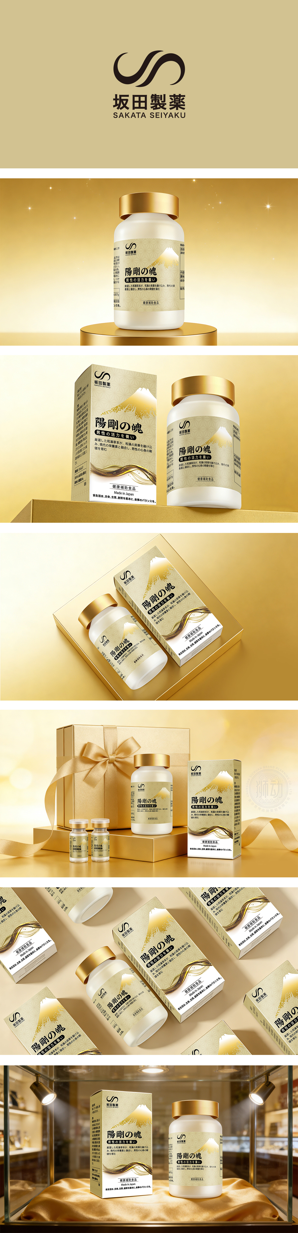
狮动设计采用以金色系为主色调(瓶盖、富士山图案、背景渐变、底座),搭配米白/乳白的瓶身与标签底色,形成强烈的“高端-纯粹”对比:金色:既是男性力量感的象征(呼应“陽剛の魂”的产品定位),也传递出“珍贵、有效的健康投资”的心理暗示,符合消费者对“男性活力补充”产品的期待(愿意为品质付费);米白/乳白:中和了金色的厚重,带来“安全、天然”的感受,通过“克制的奢华”建立起“可靠、高端”的品牌形象,完美匹配中年男性的审美——不花哨,有质感。
Lion design uses gold as the main color (bottle cap, Mount Fuji pattern, background gradient and base), with off-white/milky bottle body and label background color, forming a strong "high-end-pure" contrast: gold is not only a symbol of male strength (echoing the product positioning of "masculine soul"), but also conveys the psychological hint of "precious and effective health investment". Off-white/off-white: It neutralizes the golden massiness and brings the feeling of "safety and naturalness". Through "restrained luxury", it establishes a "reliable and high-end" brand image, which perfectly matches the aesthetics of middle-aged men-not fancy, but textured.


扫码或拨打添加客服微信


