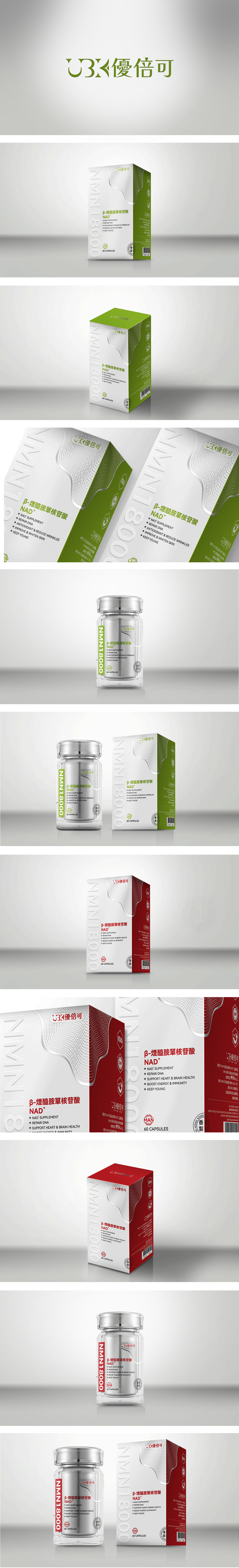
狮动设计主色调以绿色+白色为主,绿色象征“天然、健康”,白色代表“纯净、专业”,符合保健品“安全、有效”的心理预期;纹理与造型:正面有波浪形线条,隐喻“细胞活力”或“新陈代谢”,增强科技感与动态感;该包装通过清晰的成分标识、针对性的功效宣传、女性友好的设计,强化了“女性专属抗衰老保健品”的定位。绿色与白色的搭配、认证标志的使用,进一步建立了“天然、安全、有效”的产品形象,符合目标用户对“健康美容”的需求。
Lion design is mainly green+white, green symbolizes "nature and health" and white represents "purity and professionalism", which conforms to the psychological expectation of "safety and effectiveness" of health care products. Texture and modeling: there are wavy lines on the front, which symbolize "cell vitality" or "metabolism" and enhance the sense of science and technology and dynamics; Through clear component identification, targeted efficacy publicity and female-friendly design, the packaging strengthens the positioning of "exclusive anti-aging health care products for women". The combination of green and white, and the use of certification marks have further established a "natural, safe and effective" product image, which meets the needs of target users for "health and beauty".


扫码或拨打添加客服微信


