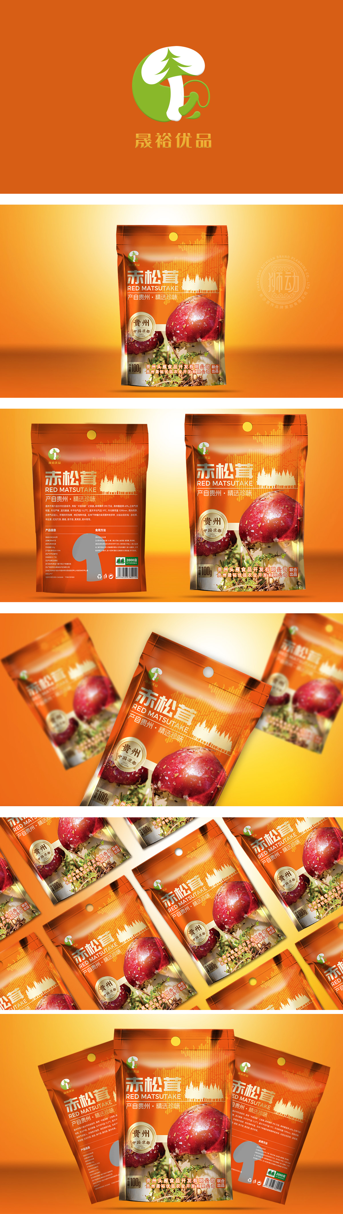
狮动设计采用暖橙色渐变,模拟森林土壤或阳光的质感,既符合“干货”的温暖属性,又传递“天然食材”的亲和力。背景辅以抽象树林纹理与细碎叶脉图案,强化“赤松茸产自森林”的场景联想,包装的视觉重心是超大尺寸的赤松茸实物图:赤松茸主体呈红棕色菌盖+白色菌柄(带天然泥土与草屑),细节清晰(如菌盖的鳞片、菌柄的纤维感),直接传递“新鲜采摘、未过度加工”的信任感;菌盖上方的白色斑点,帮助消费者快速识别产品种类。这种“实物特写+场景化细节”的设计,比文字更能激发“想尝试”的欲望,这是一款“懂消费者”的包装——既让老用户快速识别“熟悉的好产品”,也让新用户通过“视觉与信息”快速建立对“贵州赤松茸”的认知。
Lion Movement team conducted in-depth redesign adopts warm orange gradient to simulate the texture of forest soil or sunshine, which not only conforms to the warm attribute of "dry goods", but also conveys the affinity of "natural ingredients". The background is supplemented by abstract forest texture and fine vein pattern, which strengthens the scene association of "Tricholoma matsutake is produced in the forest". The visual center of the packaging is the oversize physical picture of Tricholoma matsutake: the main body of Tricholoma matsutake is reddish-brown with white stipe (with natural soil and grass clippings), and the details are clear (such as the scales of the stipe and the fiber feeling of the stipe), which directly conveys the trust of "fresh picking and not over-processing".


扫码或拨打添加客服微信


