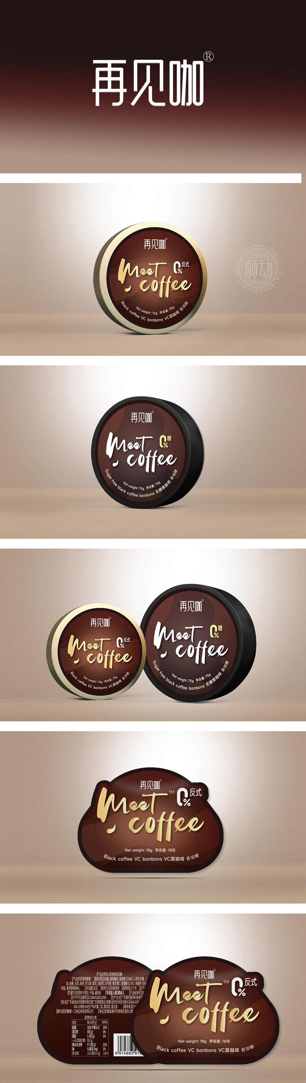
狮动团队以深棕底色+金色边框/字体为核心调性,整体呈现经典、轻奢的质感,符合咖啡类产品“精致、有调性”的消费认知:主色:深棕色(接近咖啡液的颜色),传递“浓郁、纯粹”的产品属性;点缀色:金色(边框、“Meet Coffee”字体),提升高端感,强化“品质之选”的印象;通过视觉质感(深棕+金色)强化“高端”,通过健康符号(0%反式、VC)建立“放心”,通过清晰信息(咖啡糖、净含量)解决“认知”,最终实现“让目标消费者快速识别并产生购买欲望”的目的。
Lion design takes dark brown background+gold border/font as the core tonality, and presents a classic and luxurious texture as a whole, which conforms to the consumption cognition of "exquisite and tonality" of coffee products: the main color: dark brown (close to the color of coffee liquid), conveying "rich and pure" product attributes; Decorative color: gold (border, "Meet Coffee" font) to enhance the sense of high-end and strengthen the impression of "quality choice"; Strengthen the "high-end" through visual texture (dark brown+gold), establish "reassurance" through health symbols (0% trans, VC), solve "cognition" through clear information (coffee sugar, net content), and finally realize the goal of "making target consumers quickly identify and generate purchase desire".


扫码或拨打添加客服微信


