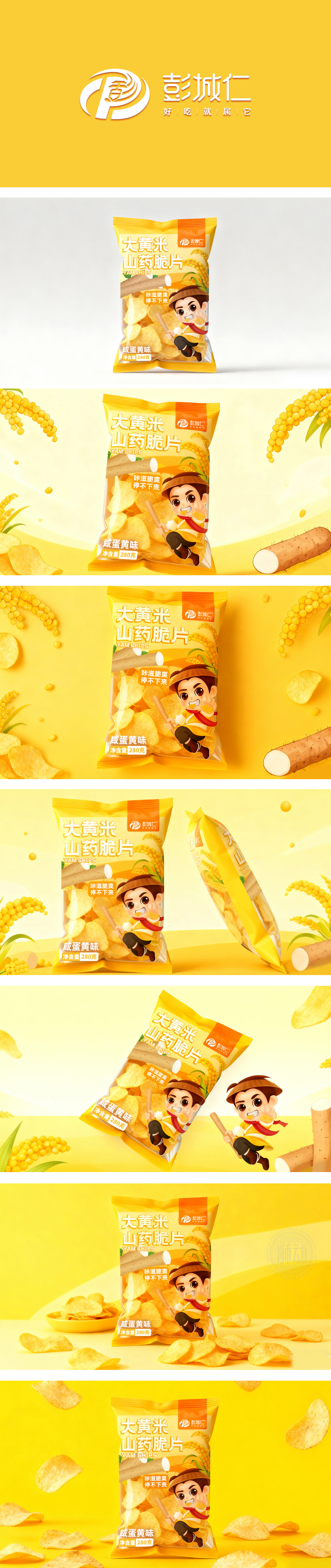
狮动设计采用暖色调(橙+黄)为主基调,符合休闲食品“活力、愉悦”的情绪联想,同时通过传统元素与现代设计的融合,打造“有记忆点的国民零食”形象:传统符号:卡通人物(主角):穿明黄色传统服饰、戴斗笠、系红围巾,手持“拐杖”,表情夸张、动作活泼,传递“接地气、有烟火气”的感觉;原料图案:背景中的大黄米穗、山药段,用具象的食材图像强化“真材实料”的认知;这是一款“长得像零食、说得清卖点、让人心动”的包装。
Lion design adopts warm tone (orange+yellow) as the main tone, which conforms to the emotional association of snack food "vitality and pleasure". At the same time, through the integration of traditional elements and modern design, the image of "national snack with memory points" is created: traditional symbols: cartoon characters (protagonists): wearing bright yellow traditional costumes, wearing hats, wearing red scarves and holding "crutches", with exaggerated expressions and lively movements. Raw material pattern: the ear of rhubarb rice and the segment of yam in the background, and the cognition of "real material" is strengthened with concrete food images; This is a package that looks like a snack, makes the selling point clear and makes people feel excited.


扫码或拨打添加客服微信


