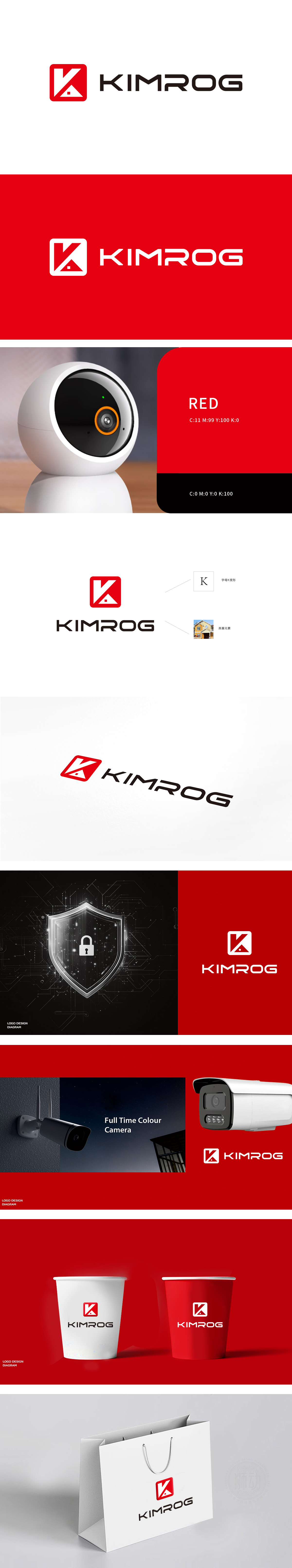
狮动设计采用“K”与房子的融合:白色“K”字母被巧妙拆解为“房子”的轮廓——竖线是“墙”,斜线是“屋顶”,下方的三角+小方块则是“带报警装置的屋檐”(小方块像摄像头或传感器)。这种“字母+功能符号”的融合,既强化了品牌识别,又直接点出了保护对象(房子=家庭/财产),实现了“品牌名-行业属性-核心价值”的三位一体。红色是安防行业的“天然语言”——警示、醒目的视觉刺激,直接关联“警惕、防护”的心理暗示;方形则象征“稳定、边界、可靠”,像一道“安全屏障”,呼应安防设备“守护边界”的核心功能。整体把抽象的“安全”,变成了可感知、可记忆的“视觉体验”。
Lion design adopts the fusion of "K" and house: the white letter "K" is ingeniously disassembled into the outline of "house"-the vertical line is "wall", the diagonal line is "roof", and the triangle+small square below is "eave with alarm device" (small square is like a camera or sensor). This combination of "letters+functional symbols" not only strengthens brand recognition, but also directly points out the object of protection (house = family/property) and realizes the trinity of "brand name-industry attribute-core value". Red is the "natural language" of the security industry-warning and eye-catching visual stimulation are directly related to the psychological hints of "vigilance and protection"; The square symbolizes "stability, boundary and reliability", which is like a "safety barrier" and echoes the core function of security equipment to "guard the boundary".


扫码或拨打添加客服微信


