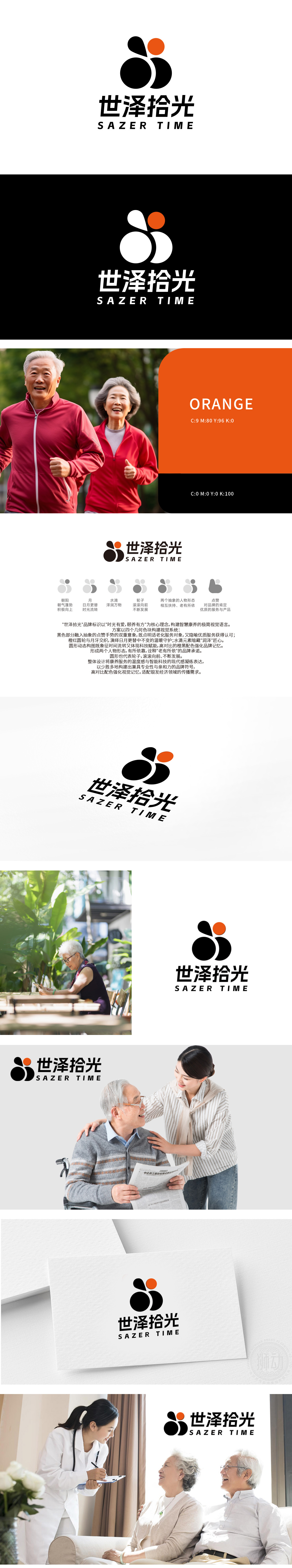
狮动设计用双环+水滴+橙点构成,整体抽象但充满情感指向,完美贴合养老的核心诉求——“有温度的陪伴”:双环结构(下方两个重叠的黑圆):形成“你中有我”的互动感。这种设计象征“老人与陪伴者的共生关系”:代表养老社区中“老人-护理者-同伴”的互助网络。环的“循环”属性还隐含“生命延续”的美好寓意,符合中国人对“圆满”的追求。 水滴的“柔软感”与“滋养性”,精准对应养老服务的“细致关怀”——像水一样渗透到老人生活的每一个细节(饮食、护理、心理疏导),传递“无微不至”的服务理念。主色调为黑+白+橙,这种组合兼顾了“专业感”与“温度感”,完全符合养老品牌的信任需求:
Lion design is composed of double rings+water drops+orange dots, which is abstract but full of emotional orientation, and perfectly fits the core demand of providing for the aged-"companionship with temperature": double ring structure (two overlapping black circles below): forming an interactive feeling of "you have me". This design symbolizes "the symbiotic relationship between the elderly and their companions" : it represents the mutual assistance network of "the elderly-caregivers-companions" in the old-age community. The "circulation" attribute of the ring also implies the beautiful implication of "life continuation", which is in line with Chinese's pursuit of "perfection".


扫码或拨打添加客服微信


