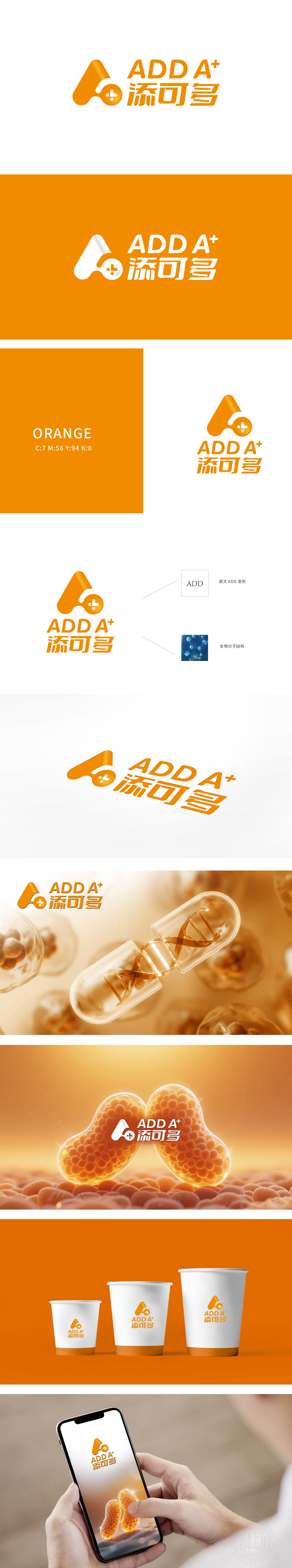
狮动设计采用弧度饱满的「A」形轮廓,像极了细胞的形态(生物科技的核心载体),又暗含「DNA双螺旋」的曲线感(生命科学的标志性符号),自带「生长、活性」的联想;中间的「十字」不是随便加的——它是医疗/实验室的经典符号,瞬间把「生物科技」的专业感拉满, 这种「具象符号抽象化」的处理,让用户快速get「行业属性」,单看图形就知道:这是一家和「生命科学、健康增益」相关的公司。
Lion design adopts an "A"-shaped outline with full radian, which resembles the shape of cells (the core carrier of biotechnology), and implies the curve sense of "DNA double helix" (the symbolic symbol of life science), with its own association of "growth and activity"; The "cross" in the middle is not added casually-it is a classic symbol of medical treatment/laboratory, which instantly fills up the professional sense of "biotechnology". This kind of "figurative symbol abstraction" processing allows users to quickly get "industry attributes", and just look at the graphics and you will know that this is a company related to "life science and health gain".


扫码或拨打添加客服微信


