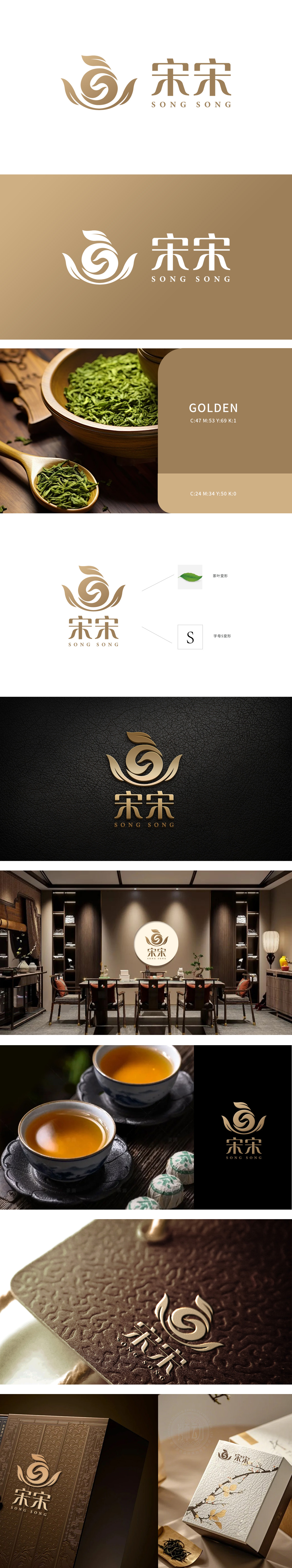
狮动从茶文化与品牌调性切入:叶片元素呼应茶源生态,螺旋线条既似茶汤旋涌韵律,暗藏品牌传承脉络;烫金质感契合高端茶礼定位,字体融宋韵风骨与现代简约。新客户初见该LOGO,叹叶片灵动传递自然气韵,螺旋细节暗叙品牌故事,金色调性精准锚定高端茶市,直言从视觉符号里读懂“宋宋”匠心,对狮动深挖行业基因的设计能力由衷佩服。
The lion moves from tea culture and brand tonality: the leaf elements echo the ecology of tea source, and the spiral lines are like the rhythm of tea soup, hiding the brand inheritance context; The bronzing texture is suitable for the positioning of high-end tea ceremony, and the font is integrated with song rhyme and modern simplicity. When new customers saw the LOGO at first sight, they sighed that the leaves conveyed the natural charm, the spiral details narrated the brand story.


扫码或拨打添加客服微信


