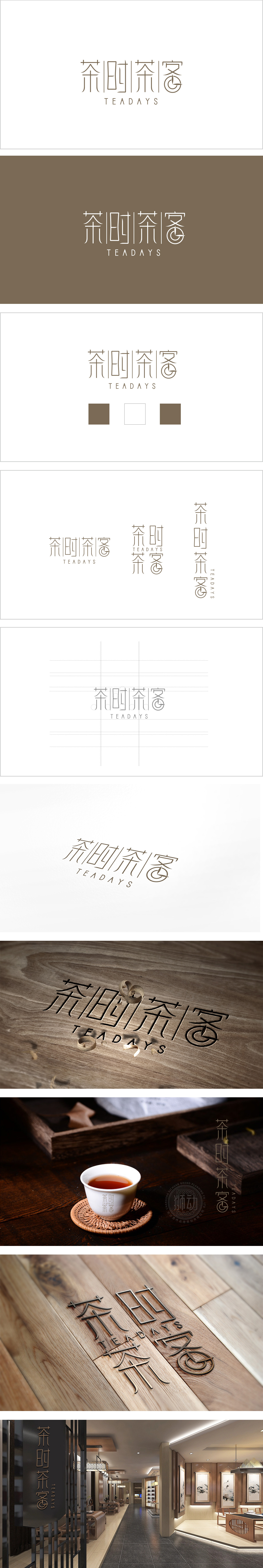
狮动设计采用极简新中式字体:“茶”字保留了茶叶的舒展感;“时”字的方块结构像一扇“门”,暗示“茶时光”是生活的入口;最妙的是“客”字的右侧变形:原本的“各”被设计成漩涡状的茶盏,线条的流动感模拟了茶汤倒入杯中的漩涡,呼应了“喝茶”的核心场景,能看到其将“传统茶意”与“现代审美”融合的巧思,每一处细节都在为“茶叶”与“生活”的连接做注解:用“茶盏漩涡”讲“喝茶的动作”,用“时”字讲“茶的时光”,用“客”字讲“茶的连接”——每一处细节都在传递“茶叶是生活的一部分”,既贴合茶叶的传统属性,又符合现代用户的审美需求。用设计让茶叶“活”在当下,让用户从LOGO里就能闻到“茶的香气”,摸到“茶的温度”。
Lion design adopts a minimalist new Chinese font: the word "tea" retains the sense of stretching of tea; The square structure of the word "time" is like a door, suggesting that "tea time" is the entrance to life; The most wonderful thing is the deformation of the word "Ke" on the right side: the original "Ge" is designed as a whirlpool-shaped tea cup, and the flowing sense of the lines simulates the vortex of tea soup pouring into the cup, echoing the core scene of "drinking tea", and we can see its ingenious thinking of combining "traditional tea meaning" with "modern aesthetics", and every detail is making comments on the connection between "tea" and "life": Use design to make tea "live" in the moment.


扫码或拨打添加客服微信


