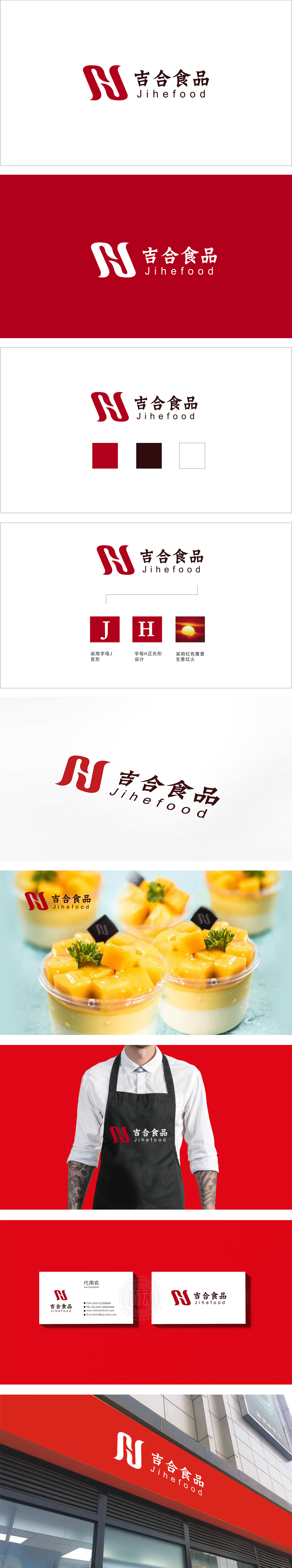
狮动设计以红色为基调,通过流畅的曲线将字母“J”与“H”变形:“J”的动态延伸:传递出“吉祥”的柔和与包容性;“H”的隐性结构:,形成“一笔双关”的视觉效果,既保留了字母的识别性,又通过连贯的线条强化了“吉”与“合”的关联,呼应“吉合”品牌名的“融合、和谐”寓意。整体形态:图形整体象征食材与文化的交融,传递出食品行业的“合作、共享”理念,通过正负形、色彩象征等手法,将字母、文化寓意(吉祥、红火)、行业属性(食品的温暖、融合)浓缩为一个整体符号,赋予品牌“吉祥、红火、融合”的情感价值。
Lion design is based on red, and the letters "J" and "H" are deformed through smooth curves;The dynamic extension of "J": it conveys the softness and inclusiveness of "auspiciousness"; The hidden structure of "H": it forms the visual effect of "a pun", which not only retains the recognition of letters, but also strengthens the connection between "Ji" and "He" through coherent lines, echoing the meaning of "integration and harmony" in the brand name of "Ji He". Overall form: the graphics symbolize the blending of ingredients and culture as a whole, conveying the concept of "cooperation and sharing" in the food industry.


扫码或拨打添加客服微信


