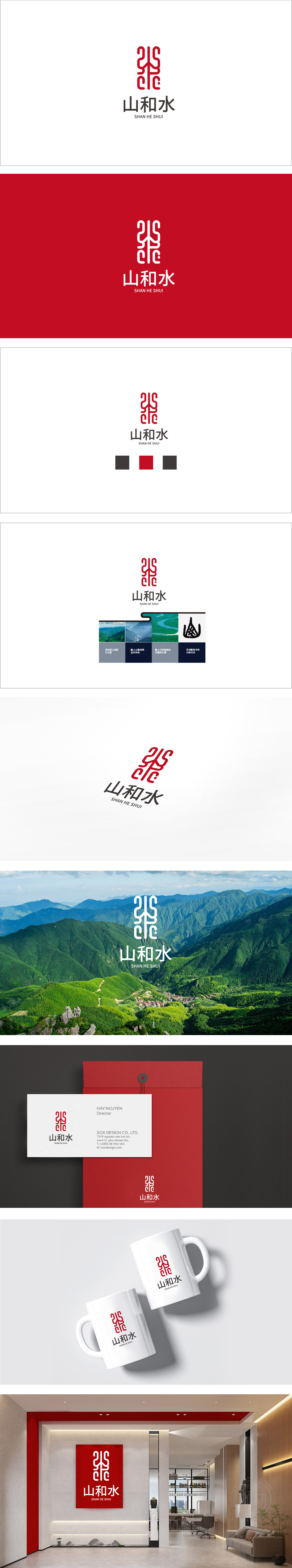
狮动设计将“山”“水”的汉字笔画与云纹、穿插曲线模拟“水纹”,整体通过对称结构强化“和谐”感传统语义:古典纹的“连续不断”、云纹的“祥瑞”、水纹的“灵动”,共同传递中式食品“自然、吉祥、传承”的属性,符合消费者对“中式味道”的心理预期。采用分层叠加的设计,增加纹样的层次感与立体感,通过“传统纹样(抽象)+ 圆黑体(汉字)+ 无衬线(英文)”的组合,完美传递了“山和水”品牌的“中式传统味道,现代品质体验”的定位,精准传递“天然、正宗、有文化温度”的中式食品定位。
Lion Design simulates the Chinese character strokes of "mountain" and "water" with moire and interspersed curve, and strengthens the traditional meaning of "harmony" through symmetrical structure as a whole: continuity of classical pattern, auspicious of moire and agility of moire, which jointly convey the nature, auspiciousness and inheritance of Chinese food, which is in line with consumers' views on "Chinese style" The layered design is adopted to increase the layering and three-dimensional sense of the pattern.


扫码或拨打添加客服微信


