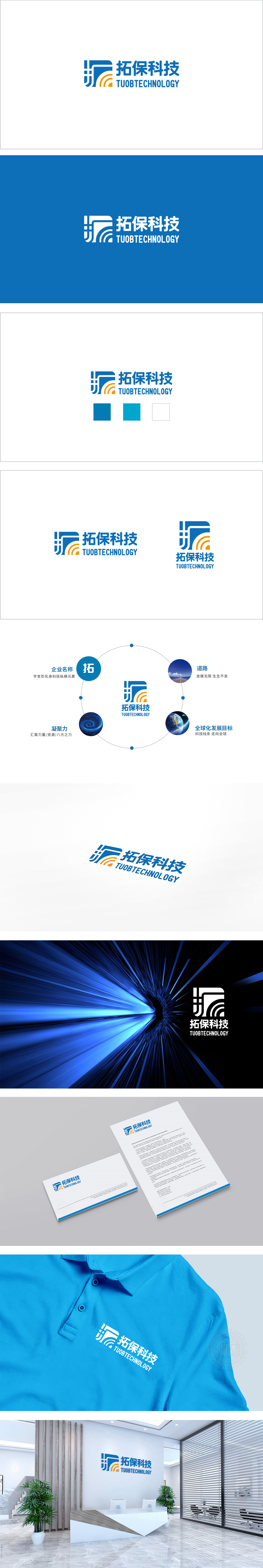
狮动设计将蓝色几何结构与橙色信号弧线组合而成,是品牌核心记忆点:蓝色几何结构线条刚硬、棱角分明,象征结构稳定、专业可靠; 几何结构的“缺口”,与信号弧线衔接,形成“开放”的视觉感,暗示品牌“拓展边界、连接未来”的发展理念。橙色信号弧线:直接关联“科技、通信、数据”等行业关键词; 整体将品牌名称(拓保)、行业属性(科技)、核心价值(拓展、保障)浓缩为可视觉化的符号;直接传递品牌“拓展业务边界、保障技术服务”的核心价值。
The blue geometric structure of Lion Motion Design is combined with the orange signal arc, which is the core memory point of the brand: the blue geometric structure is rigid and angular, which symbolizes the stability, professionalism and reliability of the structure; The "gap" of the geometric structure is connected with the signal arc, forming an "open" visual sense, suggesting the brand's development concept of "expanding the border and connecting the future". Orange signal arc: directly related to industry keywords such as "technology, communication, data".


扫码或拨打添加客服微信


