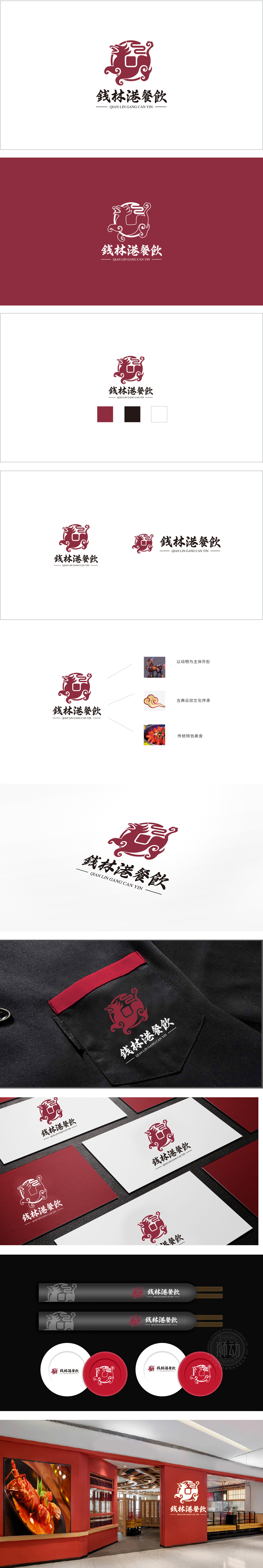
狮动设计以“餐饮品牌的商业目标”为核心,将传统符号进行“功能化转化”:瑞兽传递“吉祥、靠谱”的品牌印象;云纹引导视线、强化场景联想;红色激发食欲、符合餐饮的生理属性。这种“形式服务于内容”的设计逻辑,让“钱林港餐饮”的LOGO既具有强烈的视觉记忆点,又能精准传达品牌的核心价值——一家“有文化底蕴、有烟火气、靠谱放心”的餐饮品牌。
Lion design takes "the commercial goal of catering brand" as the core, and "functionally transforms" traditional symbols: Ruishou conveys the brand impression of "auspicious and reliable"; Moire guides the line of sight and strengthens the scene association; Red stimulates appetite and conforms to the physiological attributes of catering. This design logic of "form serves content" makes the LOGO of "Qianlin Port Catering" not only have strong visual memory, but also accurately convey the core value of the brand-a catering brand with "cultural heritage, fireworks, reliability and reassurance".


扫码或拨打添加客服微信


