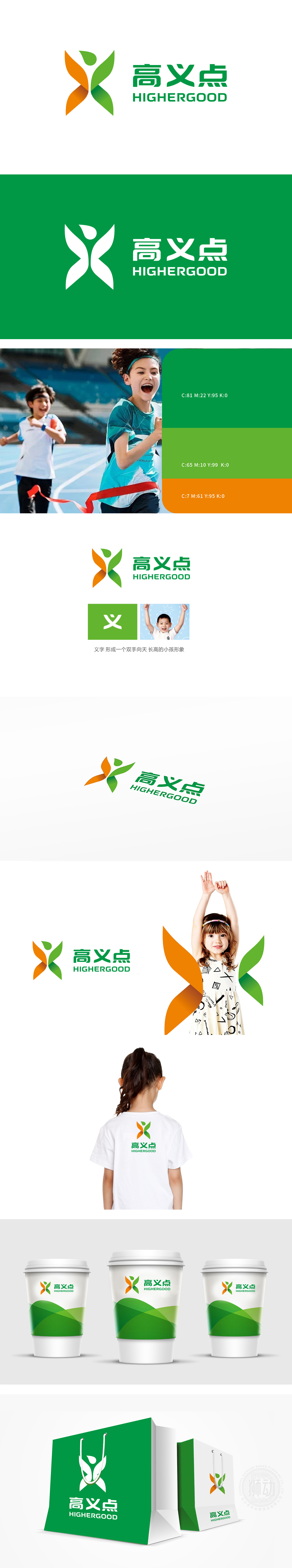
狮动设计由橙色与绿色渐变的抽象人形符号构成,整体呈“X”形交叉向上延展,巧妙勾勒出“双臂舒展、向上跃起”的人体姿态,传递出突破束缚、主动成长的运动感,橙色与绿色分别象征活力(温暖、积极)与生命力(自然、健康),双色调渐变形成视觉流动感,如同能量向上汇聚。通过“动态图形+汉字意象+场景锚定”的三重设计逻辑,让“高义点”LOGO不仅是视觉标识,更成为传递“运动、成长、责任”的情感媒介。
Lion design is composed of abstract humanoid symbols with orange and green gradations, which extend upward in an X-shape, cleverly outlining the human posture of "stretching arms and leaping upward", conveying the sense of movement that breaks through the shackles and actively grows. Orange and green symbolize vitality (warmth and positivity) and vitality (nature and health) respectively, and the gradient of two colors forms a sense of visual flow, just like the upward convergence of energy.


扫码或拨打添加客服微信


