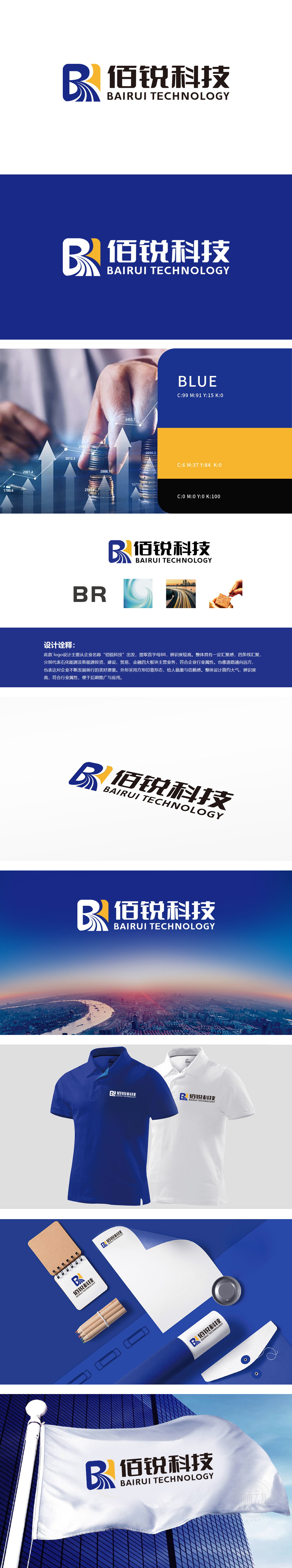
狮动设计以企业名称首字母“BR”为核心创意起点,通过几何化处理形成高辨识度的视觉符号,强化品牌记忆点。“B”采用方形印章轮廓,传递稳重、权威的企业形象;内部融入“R”的变形设计,并以蓝色渐变线条勾勒,兼具科技感与流动感汇聚线条:图形中四条蓝色流线从四周向中心汇聚,象征企业四大主营业务——化石能源及新能源投资、建设、贸易、金融的协同整合,体现“图形分析与综合型企业”的属性,寓意资源汇聚、多元发展。流线造型同时抽象为“延伸的道路”,象征企业在行业赛道上稳步前行、拓展未来的愿景,整体设计兼顾“行业属性、品牌辨识度、文化内涵”,成功将企业名称、业务板块、发展愿景浓缩为直观且富有深意的视觉符号。
Lion design takes the initial "BR" of the enterprise name as the core creative starting point, and forms a highly recognizable visual symbol through geometric processing to strengthen the brand memory. "B" adopts a square seal outline to convey a stable and authoritative corporate image; The deformation design of "R" is integrated into the interior, and it is outlined with blue gradient lines, which have both a sense of science and technology and a sense of mobility. Four blue streamline lines in the graph converge from all sides to the center, symbolizing the collaborative integration of the four main businesses of the enterprise-fossil energy and new energy investment, construction, trade and finance.


扫码或拨打添加客服微信


