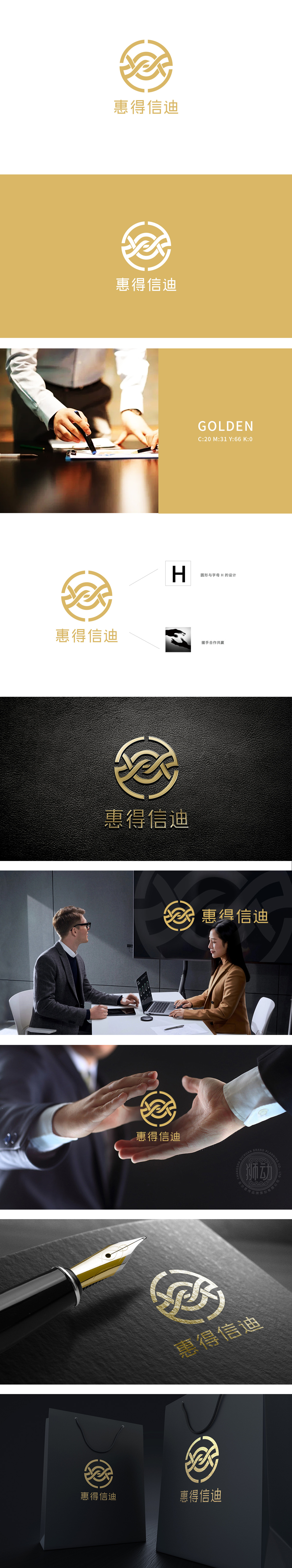
狮动设计通过“H”字母的隐藏设计,字母形态与环形交织,暗示“以人才为核心”的组织战略,人力资源如同纽带,将个体价值与企业目标紧密绑定,呼应“以人为本”的管理理念。金色圆环象征企业与员工的“共生系统”,寓意人力资源管理的“完整性”——从人才吸引、培养到留存、发展的全周期闭环,体现对员工职业生命周期的持续投入。交织线条:象征人力资源管理中打破壁垒、促进跨团队协同的目标,同时线条的动态感传递“人才活力”与“组织灵活性”,暗合现代HR对“敏捷团队”和“人才发展”的追求。整体将“以人才为核心、以合作为纽带、以共赢为目标”的人力资源理念融入视觉符号中。
Lion design uses the hidden design of the letter "H", and the letter form is intertwined with the ring, suggesting the organizational strategy of "taking talents as the core". Human resources are like a link, which closely binds individual values with enterprise goals and echoes the management concept of "people-oriented". The golden circle symbolizes the "symbiotic system" between enterprises and employees, implies the "integrity" of human resource management-the closed loop of the whole cycle from talent attraction, training to retention and development, and reflects the continuous investment in employees' career life cycle.


扫码或拨打添加客服微信


