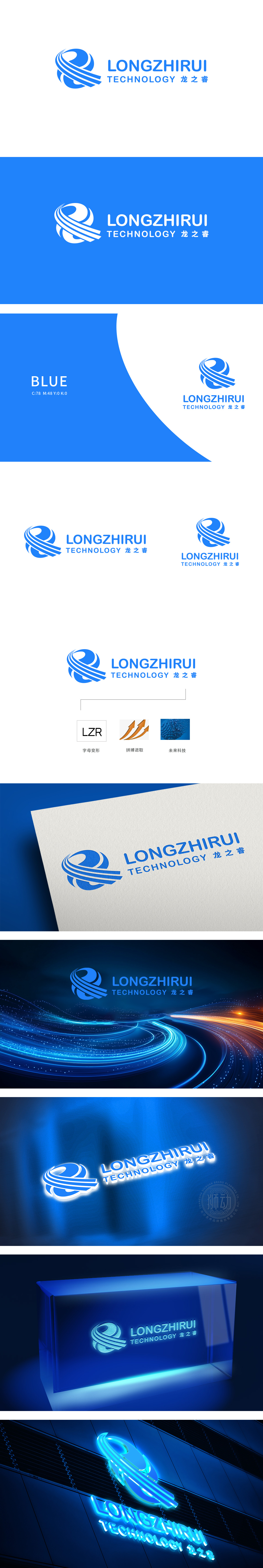
狮动设计通过品牌首字母“LZR”通过几何切割与线条重构,形成简洁的符号化标识,将蓝色为主色调(传递专业、可靠),由多个流畅的曲线环绕成抽象的“龙形”轮廓——既呼应中文“龙之睿”的“龙”字文化内涵,又通过螺旋上升的线条动感,隐喻科技企业的创新活力与发展势能。整体通过符号抽象化文化底蕴(龙)+ 科技属性(线条/色彩)+ 价值观(进取/未来),科技感与品牌基因的视觉化,符合“未来科技”的定位。
Lion Design forms a concise symbolic logo through geometric cutting and line reconstruction of the brand initials LZR, and takes blue as the main color (conveying professionalism and reliability), and is surrounded by a number of smooth curves into an abstract "dragon-shaped" outline, which not only echoes the cultural connotation of the Chinese word "dragon", but also symbolizes the innovation vitality and development potential of science and technology enterprises through the dynamic spiral lines. As a whole, cultural heritage (dragon)+scientific and technological attributes (lines/colors)+values (enterprising/future) are abstracted by symbols.


扫码或拨打添加客服微信


