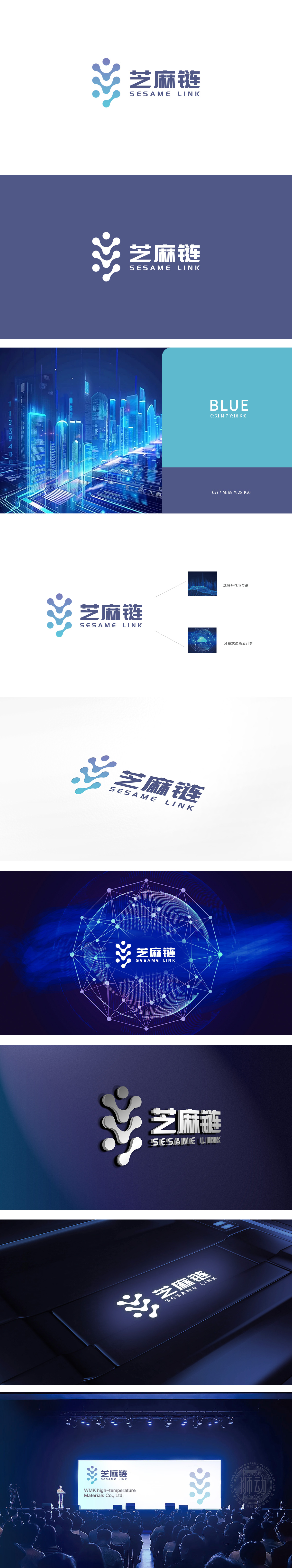
狮动设计用渐变圆形+波浪曲线组合成类似“芝麻串”的形态:蓝紫渐变的圆形从中心向四周扩散,既像“芝麻粒”的具象化,又隐喻“节点连接”的区块链/分布式特征;曲线的流动感打破了科技产品常见的“冷硬感”,增添了一丝灵动,传递出“高效连接、持续生长”的品牌气质;颜色选择上,蓝紫色系(科技感、可靠性)与浅蓝(活力、亲和力)的搭配,平衡了“技术严谨”与“用户友好”,符合互联网产品的定位。芝麻开花节节高”:用传统谚语隐喻“业务增长、价值递增”,用分布式技术连接万物,实现价值的持续增长,真正做到了“形式服务于内容”。
The lion's movement design uses a gradual circle+wave curve to form a shape similar to "sesame string":The blue-purple gradient circle spreads from the center to the periphery, which is both like the concretization of "sesame seeds" and a metaphor for the blockchain/distributed characteristics of "node connection"; The fluidity of the curve breaks the common "coldness" of scientific and technological products, adds a touch of agility, and conveys the brand temperament of "efficient connection and sustainable growth"; In terms of color selection, the combination of blue-purple series (scientific sense and reliability) and light blue (vitality and affinity) balances "technical rigor" and "user-friendliness", which is in line with the positioning of Internet products..


扫码或拨打添加客服微信


