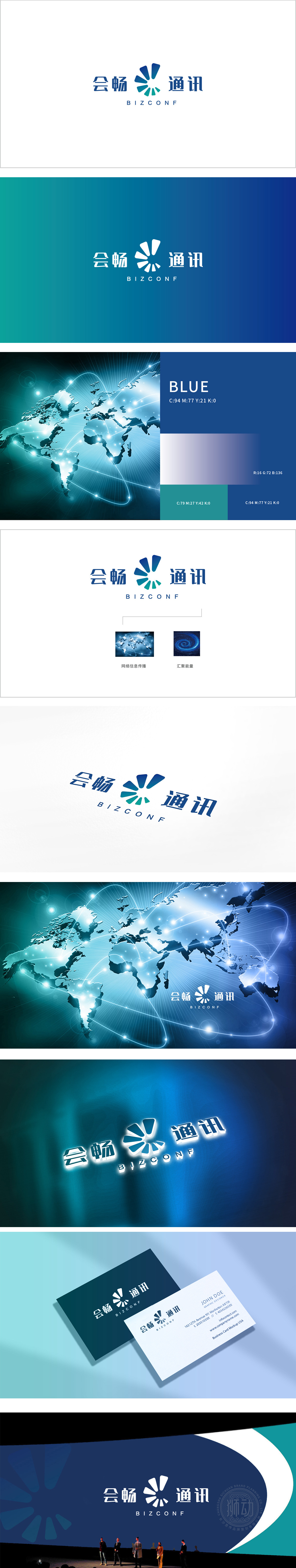
狮动设计采用花瓣状“信号辐射图形”,用“具象符号”讲“抽象功能”,LOGO的视觉焦点是中间的蓝绿色渐变花瓣图形,这一设计是整个体系的“灵魂”:花瓣呈“放射状展开”,既像信号波的辐射,又像绽放的花朵(对应“会畅”的“顺畅、开放”寓意);同时,花瓣的“对称结构”隐含“平衡与可靠”,符合企业对“稳定通讯”的价值承诺。蓝绿色渐变是科技行业的“经典安全色”,符合“会畅”作为“商务通讯工具”的严谨与灵动平衡。
Lion design adopts petal-shaped "signal radiation pattern" and uses "concrete symbols" to talk about "abstract function",The visual focus of LOGO is the blue-green gradient petal pattern in the middle, which is the "soul" of the whole system: the petals are "radially unfolded", both like the radiation of signal waves and like blooming flowers (corresponding to the meaning of "smoothness and openness"); At the same time, the "symmetrical structure" of petals implies "balance and reliability", which is in line with the value commitment of enterprises to "stable communication".


扫码或拨打添加客服微信


