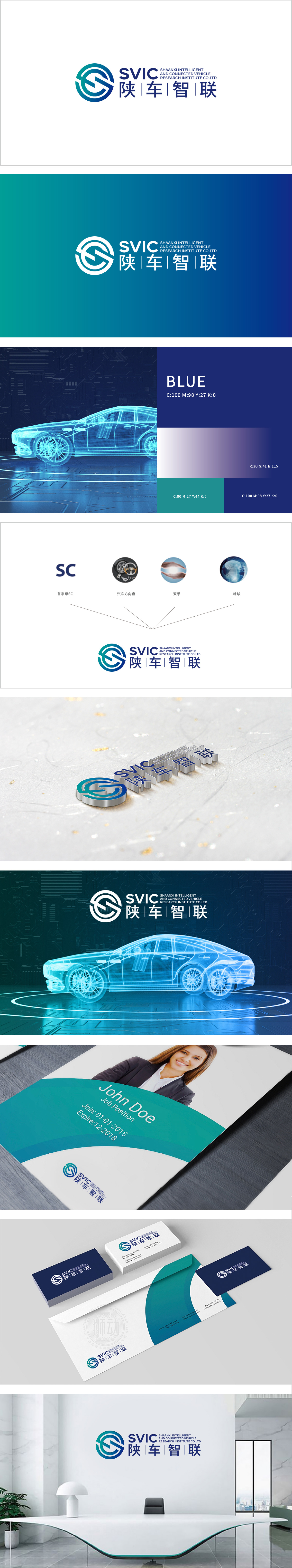
狮动设计以蓝绿色渐变环形为主体,嵌入抽象的“G”“S”字母形态。环形设计既象征科技领域常见的“循环迭代”“无限连接”,也暗合智能网联汽车的“车联网”生态闭环;内部线条通过交叉、环绕形成动态趋势,直接关联“智能”“互联”的核心业务属性。图形整体呈对称结构,却通过线条的粗细变化和渐变色彩打破呆板,传递出“稳定中蕴含活力”的视觉印象,符合科技企业严谨与创新并存的特质。将图形符号(动态环形=智能互联)、色彩系统(蓝绿渐变=科技未来)、文字信息(陕车智联=地域+行业) 的有机结合,实现了“视觉美学-品牌定位-行业属性”的三维统一。
Lion design is based on the blue-green gradient ring, and the abstract letter form of "G" and "S" is embedded. The circular design not only symbolizes the common "cyclic iteration" and "infinite connection" in the field of science and technology, but also coincides with the ecological closed loop of "vehicle networking" of intelligent networked vehicles; Internal lines form a dynamic trend by crossing and surrounding, which directly relates to the core business attributes of "intelligence" and "interconnection". The overall graphic structure is symmetrical, but it breaks the rigidity through the thickness change of lines and the gradual color change, conveying the visual impression of "stability contains vitality", which is in line with the characteristics of rigorous and innovative coexistence of technology enterprises.


扫码或拨打添加客服微信


