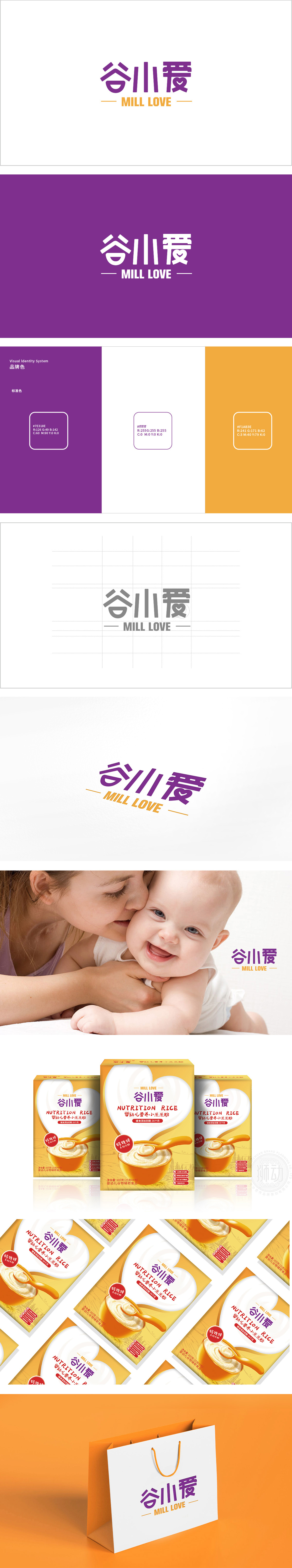
狮动设计将“谷”字以简约的几何线条构成,“八”字变形为两片对称的“谷穗”或“叶片”,既点明了“谷物”这一婴儿米粉的核心原料,传递出天然、安全的产品属性。“口”字设计成微笑的弧线,既像婴儿张开的小嘴,又暗示“美味”“易食用”,贴合婴幼儿产品的温馨调性。温柔紫+暖橙,平衡专业与亲和力,整体通过对文字本身的创意变形,将“谷物原料、婴儿适配、爱心呵护”三大核心要素融入字形中,同时色彩与字体风格精准匹配母婴群体的审美偏好——既有“天然安全”的专业感,又不失“温馨童趣”的亲和力。
Lion design makes the word "grain" with simple geometric lines, and the word "eight" is transformed into two symmetrical "ears of grain" or "leaves", which not only points out the core raw material of baby rice noodles, but also conveys natural and safe product attributes. The word "mouth" is designed as a smiling arc, which is not only like a baby's small mouth, but also implies "delicious" and "easy to eat", which fits the warmth and tonality of infant products. Gentle purple+warm orange balances professionalism and affinity. As a whole, through the creative deformation of the text itself, the three core elements of "grain raw materials.


扫码或拨打添加客服微信


