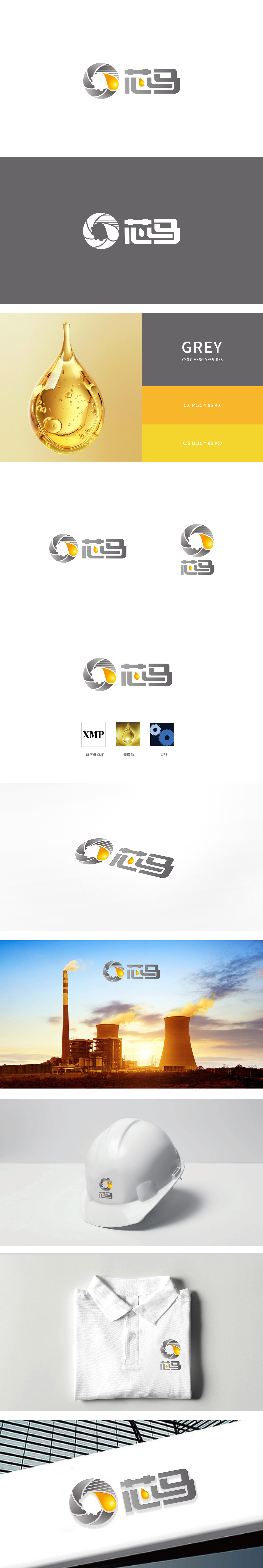
狮动设计以齿轮轮廓与流体形态(油滴)构成,形成“机械”与“能源/流体”的直接关联。齿轮作为工业、机械的经典符号,传递出技术精密感和工程属性;油滴采用渐变金色,代表润滑油、燃油等核心产品,又通过高饱和色彩形成视觉焦点,增强记忆点。动态与平衡:齿轮的放射状线条与油滴的流动感形成动静对比,灰色调的齿轮稳重扎实,金色油滴灵动醒目,整体构图在圆形框架内达成平衡,传递“稳定中蕴含活力”的品牌气质。
Lion design is composed of gear profile and fluid form (oil drop), forming a direct relationship between "machinery" and "energy/fluid". As a classic symbol of industry and machinery, gears convey a sense of technical precision and engineering attributes; The oil droplets adopt gradient gold color, which represents core products such as lubricating oil and fuel oil, and form visual focus through high saturated color to enhance memory points. Dynamics and balance: the radial lines of the gear form a dynamic and static contrast with the flowing feeling of the oil droplets.


扫码或拨打添加客服微信


