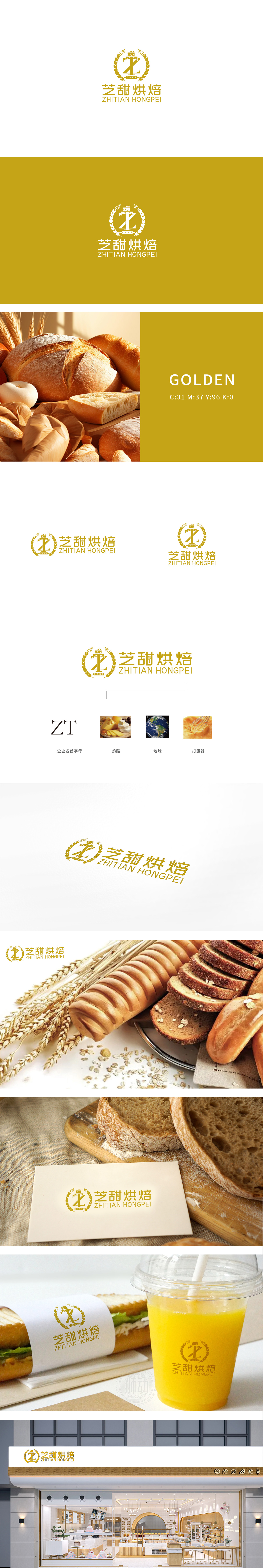
狮动设计以品牌名称首字母“Z”和“T”为骨架,通过流畅的曲线与硬朗的直线结合,形成向上延伸的动态结构:“Z”的折线如同烘焙工具的抽象化,“T”的竖线则强化了稳定感,通过“桂冠”的经典意象传递“高品质、荣誉感”的品牌定位。金色在商业设计中常与“高端、奢华、温暖”关联,契合烘焙产品带来的“甜蜜、精致”消费心理;整体造型简洁且具有记忆点,将“天然原料”为根基,以“精致工艺”为核心,致力于提供兼具品质与情感价值的烘焙产品。
Lion design takes the initials Z and T of the brand name as the skeleton, and forms an upward dynamic structure through the combination of smooth curves and tough straight lines: the broken line of Z is like the abstraction of baking tools, while the vertical line of T strengthens the sense of stability, and conveys the brand positioning of "high quality and honor" through the classic image of "laurel". Gold is often associated with "high-end, luxury and warmth" in commercial design, which fits the "sweet and exquisite" consumer psychology brought by baking products.


扫码或拨打添加客服微信


