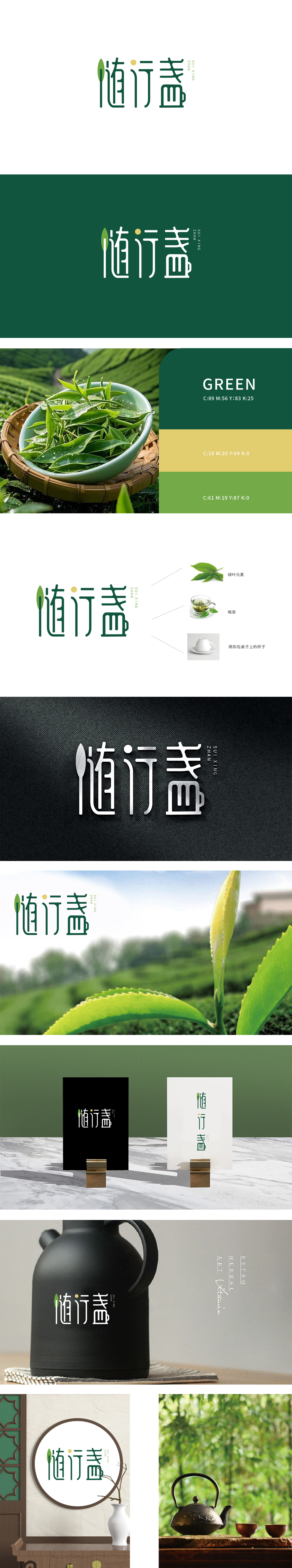
狮动设计将线性手写体与几何线条的融合,笔画间保留了手写的流动感,同时通过直线与曲线的穿插,既呼应了茶盏的轮廓弧度,又传递出“行走、便携”的动态感,巧妙契合“随行”的品牌名含义。“盏”字的图形化再造为一个简化的茶盏轮廓,强化自然、健康的茶品类联想,叶片的倾斜角度与“随行”的动态感呼应,仿佛一片茶叶轻盈随行。深绿色+浅绿色渐变:深绿象征茶叶的醇厚底蕴,浅绿传递清新自然,符合茶行业“传统、健康”的核心认知;文字整体风格简约而不简单:线性笔触如同茶筅搅拌茶汤的纹路,如同品茶时“动中有静”的意境。
Lion Design adopts the fusion of linear handwriting and geometric lines, which keeps the flowing sense of handwriting between strokes. At the same time, through the interpenetration of straight lines and curves, it not only echoes the outline radian of the tea cup, but also conveys the dynamic sense of "walking and portability", which skillfully fits the brand name meaning of "accompanying".The graphic reconstruction of the word "Zhan" is a simplified outline of a tea cup, which strengthens the association of natural and healthy tea categories. The inclination angle of the leaves echoes the dynamic sense of "accompanying", just like a piece of tea lightly accompanying.


扫码或拨打添加客服微信


