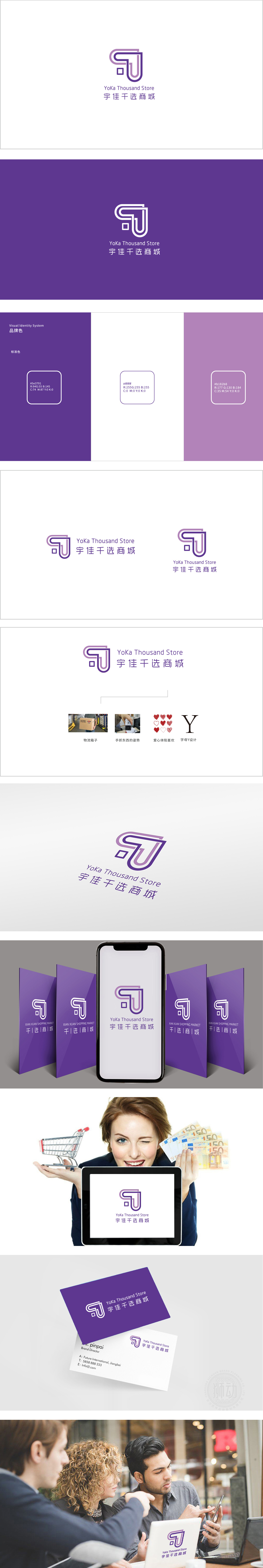
狮动设计以抽象的“Y”(宇)与“J”(佳)字母组合,线条流动与结构平衡:曲线与直线的碰撞既体现品牌的灵动性,又传递出专业与可靠(商城的品质感)。“J”的竖线底部形成闭环,象征“宇佳”的完整性与闭环服务;线条向上延伸并形成开放感,暗示商城的包容性与拓展性。紫色在商业设计中常与“高端”“时尚”“品质生活”关联,贴合“千选商城”面向注重生活品质的消费群体的定位。将“宇佳千选”的名称(YJ)、业务(精选)、价值观(品质)通过图形语言无缝融合,实现“看到图形即联想到品牌核心”的效果。成功塑造了“简约、高端、 专业”的品牌形象。
Lion design combines abstract letters "Y" (Yu) and "J" (Jia), and the lines flow and structure are balanced: the collision between curves and straight lines not only reflects the agility of the brand, but also conveys professionalism and reliability (the sense of quality of the mall). The bottom of the vertical line of "J" forms a closed loop, which symbolizes the integrity and closed-loop service of "Yujia"; The lines extend upward and form a sense of openness, suggesting the inclusiveness and expansibility of the mall. Purple is often associated with "high-end", "fashion" and "quality life" in commercial design.


扫码或拨打添加客服微信


