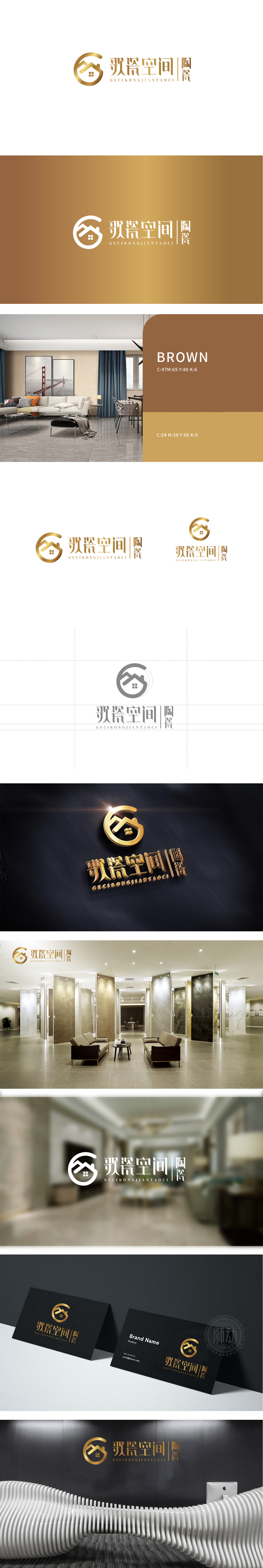
狮动设计以“G”为框架,嵌入简化的房屋轮廓,既直观传递“空间”属性,又通过线条的穿插形成“屋顶”与“陶瓷器物”的双重联想,巧妙呼应“歌瓷空间·陶瓷”的品牌核心业务。环形线条的圆润弧度与房屋直线条形成对比,柔化了空间的硬朗感,增添流动的视觉韵律,象征“空间与陶瓷艺术的融合”。LOGO通过金色材质的光泽感、线条的简约精致、符号的隐喻设计,整体呈现“轻奢、雅致、文化感”的风格,“用陶瓷艺术定义空间美学”。
Lion Design takes "G" as the frame and embeds the simplified house outline, which not only conveys the attribute of "space" intuitively, but also forms the double association of "roof" and "ceramic objects" through the interpenetration of lines, and skillfully echoes the brand core business of "Song Porcelain Space Ceramics". The rounded radian of the circular line contrasts with the straight line of the house, which softens the sense of toughness of the space, adds the flowing visual rhythm and symbolizes the "integration of space and ceramic art".


扫码或拨打添加客服微信


