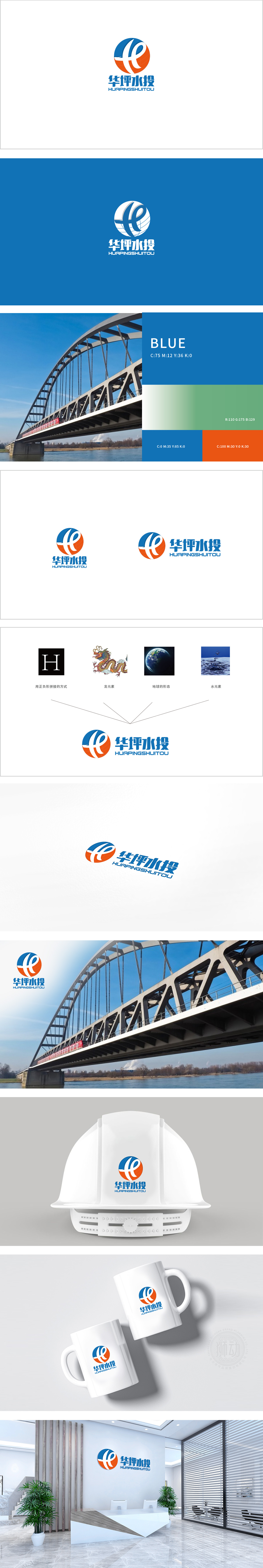
狮动设计采用“H+水流+生态圆”的三位一体,蓝色圆形作为基底,对应“地球”与“水”的包容性;白色水流线条与橙色龙形曲线共同构成字母“h”,既呼应“华坪水投”首字母,又通过冷暖色对比(蓝-橙)增强视觉冲击力;整体形态呈“内聚外展”之势:圆形内部线条交织形成稳定结构,外部曲线向上延伸,传递“发展”“进取”的品牌精神。蓝色(主色调):经典的“水”“科技”“信任”色,符合水务行业的专业性与可靠性;橙色(辅助色):象征“活力”“能源”“地方特色”。整体而言,设计既满足了品牌识别的功能性需求,又通过细节的意象化处理,赋予标识深厚的内涵,展现了对“行业属性、文化符号、视觉美学”的精准把控。
Lion design adopts the trinity of "H+ water flow+ecological circle", and the blue circle is used as the base, which corresponds to the inclusiveness of "earth" and "water"; The white water line and the orange dragon curve together form the letter "H", which not only echoes the initials of "Huaping Water Investment", but also enhances the visual impact through the contrast of cold and warm colors (blue-orange); The overall shape shows the trend of "cohesion and outreach": circular internal lines interweave to form a stable structure, and external curves extend upward, conveying the brand spirit of "development" and "enterprising". Blue (main color): the classic color of "water", "technology" and "trust", which conforms to the professionalism and reliability of the water industry; Orange (auxiliary color): it symbolizes "vitality", "energy" and "local characteristics".


扫码或拨打添加客服微信


