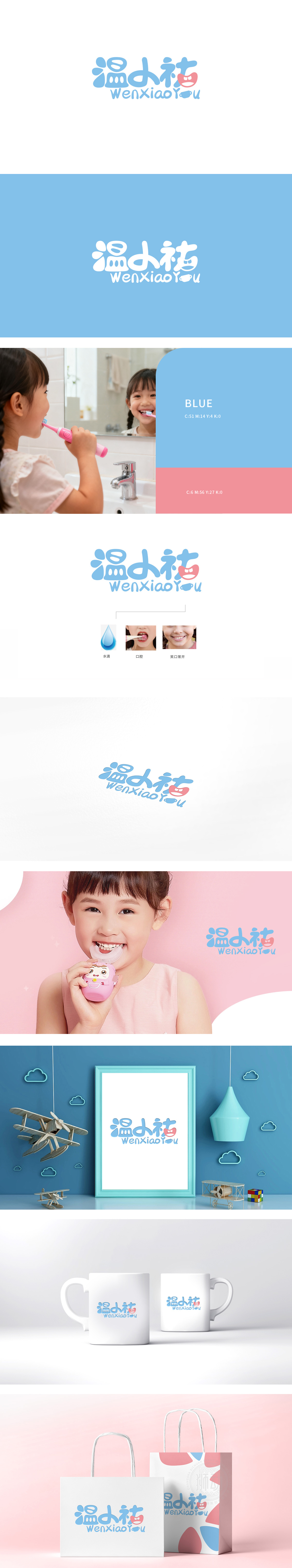
狮动设计采用圆润、手写风格的卡通字体,笔画流畅且带有弧度,符合儿童对“柔和、安全”的视觉感知;主色调为清新的浅蓝色,搭配粉色“笑脸”图形,传递温暖、亲和的品牌性格,贴合家长对儿童产品“温和、守护”的心理期待。采用小写字母+首字母大写的组合,字母“u”设计成牙刷轮廓(顶端为刷头弧形,底部为手柄直线),巧妙融入产品属性,实现“品牌名即品类联想”的视觉暗示。LOGO通过“水滴(安全)”“笑脸(效果)”传递产品的安全性和有效性,建立“专业、可靠”的品牌信任。
Lion design adopts rounded and handwritten cartoon fonts, and the strokes are smooth and radian, which conforms to children's visual perception of "softness and safety"; The main color is fresh light blue, with pink "smiling face" graphics, which conveys warm and friendly brand personality and fits parents' psychological expectation of "gentleness and protection" for children's products. The combination of lowercase letters and initial capital letters is adopted, and the letter "U" is designed as the outline of toothbrush (the top is curved with brush head and the bottom is straight with handle).


扫码或拨打添加客服微信


