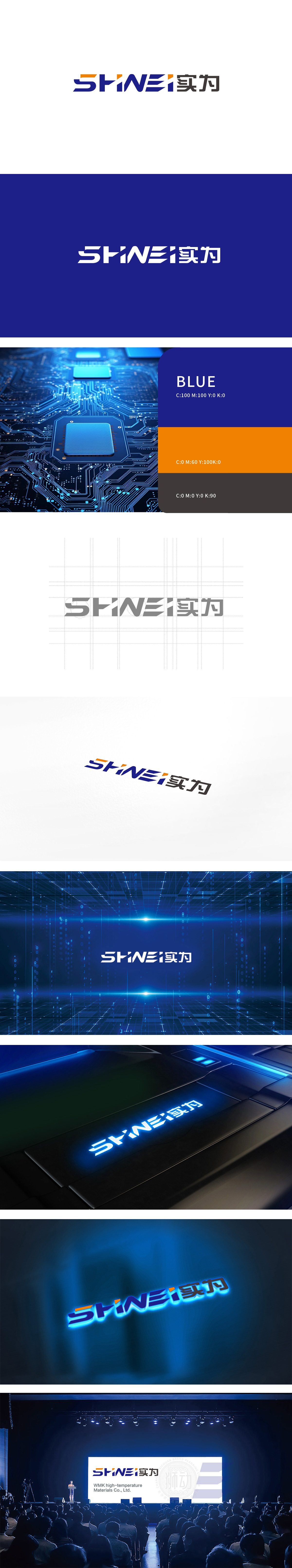
狮动设计采用无衬线体为基底,通过局部几何切割,打破静态平衡,赋予标志向前的动态感,暗合科技企业“创新进取”的属性。字母“N”的三角形切割并延伸,传递“突破、精准”的科技意象,橙色作为点缀色在蓝灰主色调中形成焦点,提升识别度。字母“SH”与“INEI”通过间距压缩,形成紧凑的整体感,符合电子设备界面“高效紧凑”的视觉逻辑,整体通过“动态结构+功能美学+行业符号”的三重逻辑,精准匹配电子科技行业属性。
Lion design uses sans serif as the base, and breaks the static balance through local geometric cutting, giving the logo a sense of forward dynamics, which coincides with the attribute of "innovation and enterprising" of science and technology enterprises.The triangle with the letter "n" is cut and extended to convey the scientific and technological image of "breakthrough and accuracy". As an ornament color, orange forms a focus in the blue-gray main color to enhance recognition. The letters "SH" and "INEI" are compressed by spacing, forming a compact sense of wholeness.


扫码或拨打添加客服微信


