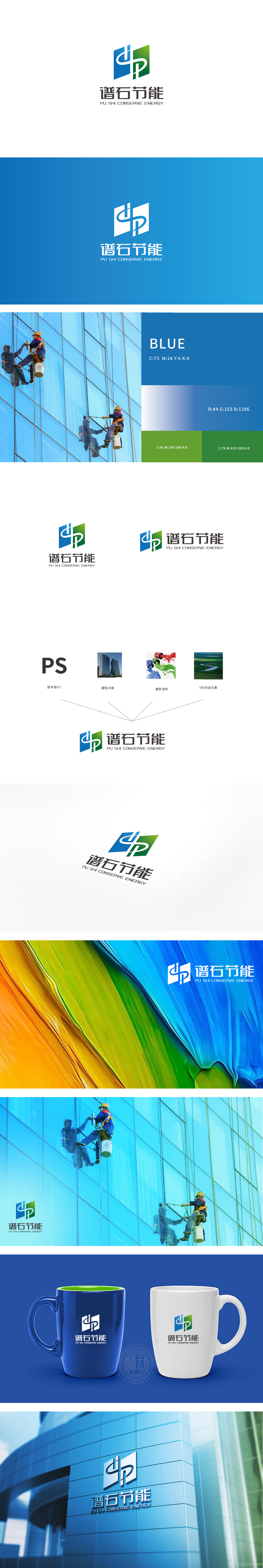
狮动设计采用“P”和“S”的艺术化组合,绿色“P”的竖线如高楼轮廓,传递“建筑节能”的行业属性,将抽象字母与具象建筑形态结合,强化场景联想。通过Logo中蓝色与绿色的渐变/拼接得以体现(蓝色沉稳、绿色环保,符合节能行业调性);而“S形河流元素”的曲线则转化为Logo中贯穿“P”和“S”的白色飘逸线条,既柔化了几何图形的硬朗感,又暗合“流动”“循环”的节能理念。整体色调清新且具有现代感,形成“刚柔并济”的视觉节奏,暗喻“技术严谨性”与“创新灵活性”的结合。
Lion design adopts the artistic combination of "P" and "S", and the vertical line of green "P" is like the outline of a tall building, which conveys the industrial attribute of "building energy saving", combines abstract letters with concrete architectural forms, and strengthens scene association. Through the gradual change/splicing of blue and green in Logo (blue is calm, green and environmentally friendly, in line with the tonality of energy-saving industry); The curve of "S-shaped river element" is transformed into white elegant lines running through "P" and "S" in Logo, which not only softens the sense of toughness of geometric figures.


扫码或拨打添加客服微信


