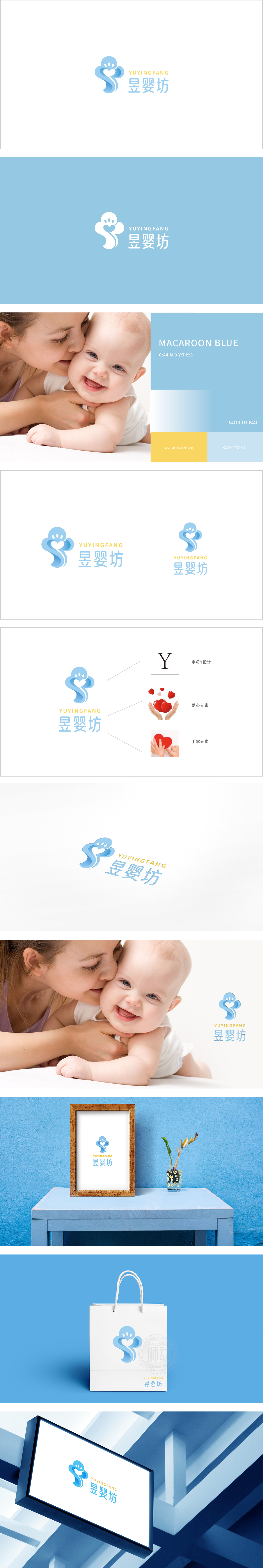
狮动设计以“守护”为核心的情感化表达,主体由抽象化的“人形环抱”与“爱心”元素融合而成:蓝色图形似两个相互依偎的抽象人形,线条柔和流畅,呈现出包裹、呵护的动态感,直观传递母婴场景中“守护”“陪伴”的核心情感,符合母婴品牌对安全感的诉求。“S”形曲线延伸自然,既平衡了左侧的紧凑感,又象征母婴关系中的“连接”与“成长”,整体造型无棱角,传递温柔、包容的品牌气质。通过“形态-色彩-文字”的协同,构建了“守护、安全、温暖、成长”的品牌核心形象。
Lion design is an emotional expression with "guardian" as the core, and the main body is a fusion of abstract elements of "human form embracing" and "love": the blue figure is like two abstract human forms snuggling up to each other, and the lines are soft and smooth, showing a dynamic sense of wrapping and caring, intuitively conveying the core feelings of "guardian" and "companionship" in the maternal and infant scene, which meets the demands of maternal and infant brands for security. The "S"-shaped curve extends naturally, which not only balances the compactness on the left side, but also symbolizes the "connection" and "growth" in the relationship between mother and baby.


扫码或拨打添加客服微信


