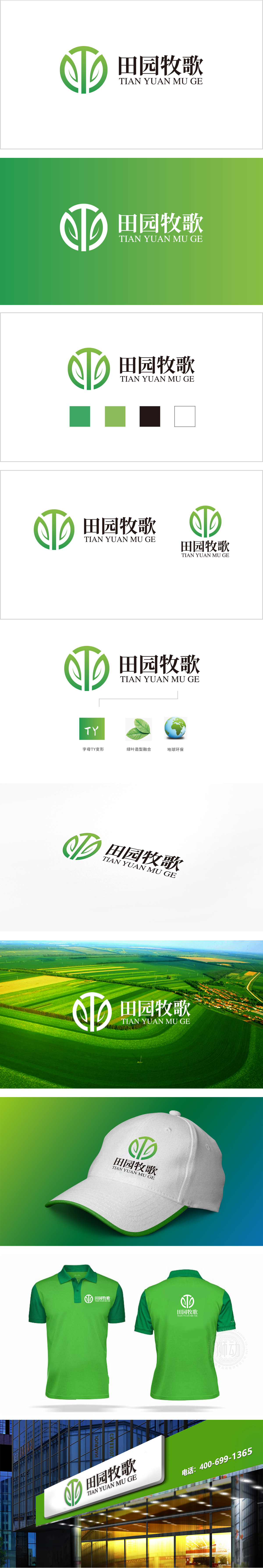
狮动设计以绿色线条勾勒出抽象化的“T”形,竖线与半圆弧构成“Y”形轮廓,通过线条的穿插与留白,实现“田”与“园”的文字意象融合,既呼应品牌名称“田园牧歌”,又形成独特的品牌记忆点。叶片与生长的视觉叙事,不仅强化了农业“绿色、自然”的属性,更通过线条的流动感传递“生命力”与“丰收”的寓意。圆形轮廓则象征循环、圆满,暗合农业生态的可持续性。绿色渐变传递“生态+专业”双重感知设计不止于“符号化农业”,更通过“形意结合”传递品牌的深层定位:从“种植”到“生活方式”的联想,从“农业生产”到“田园文化”的价值升维。
Lion Design outlines an abstract T-shape with green lines, and vertical lines and semi-circular arcs form a Y-shape outline. Through the interpenetration and blank space of lines, the text images of "Tian" and "Yuan" are integrated, which not only echoes the brand name "Pastoral", but also forms a unique brand memory point. The visual narration of leaves and growth not only strengthens the "green and natural" attribute of agriculture, but also conveys the meaning of "vitality" and "bumper harvest" through the flowing sense of lines. The circular outline symbolizes circulation and perfection, which coincides with the sustainability of agricultural ecology. The green gradient conveys the dual perception design of "ecology+specialty" not only in symbolic agriculture.


扫码或拨打添加客服微信


