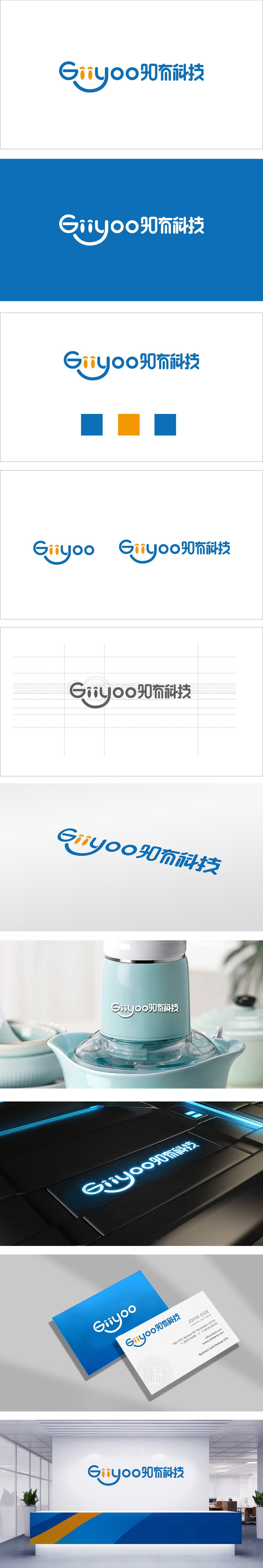
狮动设计将字母“G”采用圆润的无衬线字体,延伸出一条流畅的上扬弧线,形似微笑的嘴角,既弱化了科技品牌的冰冷感,又传递出友好、积极的品牌调性,同时弧线的延展性也暗含“连接”“拓展”的科技属性。“i”的差异化设计:两个“i”字母的点被设计为橙色的水滴状,形成视觉焦点。橙色作为活力、创新的象征,与整体蓝色形成对比,既突出了细节巧思,又隐喻科技与人文的融合。整体“通过圆润的线条、温暖的点缀色、简洁的布局,成功平衡了科技行业的“理性”与品牌的“温度”:通过字母与图形的创意融合、色彩的精准搭配,既体现了科技行业的专业属性,又传递出亲和、创新的品牌人格。
Lion design uses the letter "G" in a round sans serif font, extending a smooth upward arc, which looks like a smiling mouth, which not only weakens the coldness of technology brands, but also conveys a friendly and positive brand tonality. At the same time, the ductility of the arc also implies the scientific and technological attributes of "connection" and "expansion". Differentiated design of "I": The dots of two "I" letters are designed as orange water droplets to form visual focus. As a symbol of vitality and innovation, orange contrasts with the overall blue, which not only highlights the ingenious thinking of details, but also symbolizes the integration of technology and humanities. Overall "successfully balances the rationality of the technology industry and the temperature of the brand through rounded lines.


扫码或拨打添加客服微信


