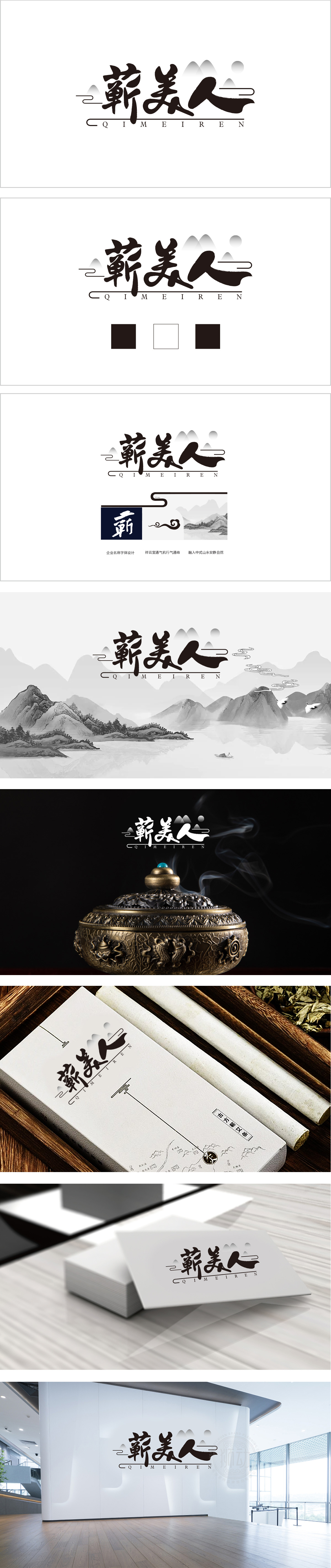
狮动设计采用“蕲美人”的书法设计,毛笔行书笔触,字形舒展灵动:“蕲”字笔画厚重沉稳,底部竖弯钩延伸出飘逸感;“美”字中部留白巧妙,似呼应“美人”的轻盈;“人”字以侧锋一笔带过,如行云流水,增强整体韵律。形成“左右错落、虚实相生”的视觉层次,既保留文字辨识度,又赋予艺术张力。远山与圆月:背景以水墨晕染的远山轮廓和(圆月)构成,暗合“天人合一”的中式哲学,同时“圆”象征圆满,山形传递沉稳意境,与“美人”的温婉形成刚柔并济的对比。以水墨丹青为灵感,通过“山水—祥云—地名”的三重符号叠加,将“蕲美人”的品牌内涵从“视觉美感”延伸至“地域文化+自然哲学”,传递出“宁静、自然、高品质”的品牌气质。
Lion design adopts the calligraphy design of "Qi Meiren", and the brush strokes, the shape is flexible: the stroke of "Qi" is heavy and steady, and the vertical hook at the bottom extends a sense of elegance; The middle of the word "beauty" is cleverly left blank, which seems to echo the lightness of "beauty"; The word "people" is swept by the side, like flowing clouds, enhancing the overall rhythm. Form a visual level of "left and right scattered, virtual and real", which not only retains the recognition of words, but also gives artistic tension. Distant mountains and full moon: The background is composed of the outline of distant mountains and the (full moon) with ink and wash, which coincides with the Chinese philosophy of "harmony between man and nature". At the same time, the "round" symbolizes perfection, and the mountain shape conveys a calm artistic conception, which is in contrast with the gentleness of "beauty".


扫码或拨打添加客服微信


