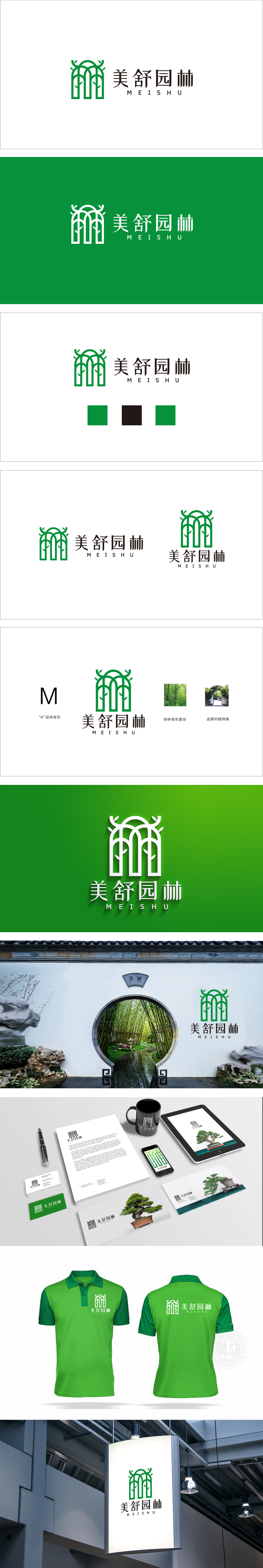
狮动设计以“形”传意,强化园林属性.由三道绿色线条构成,线条挺拔且带有圆角处理,形似“树木/竹林”的抽象化表达,既传递出园林行业的自然属性,又通过等距排列形成稳定的视觉结构,象征品牌的专业性与可靠性。搭配两侧对称的萌芽状叶片,不仅增强了图形的生机与灵动感,也暗含“园林养护”中植物生长、繁茂的寓意,呼应“美舒”所传递的“美好、舒适自然环境”的品牌理念。整体以深绿色作为主色调,绿色是园林、生态的经典符号,整体通过“具象符号(树木)→ 抽象简化(线条)→ 文化隐喻(生长、空间)”的设计路径,将“美舒园林”的行业属性、服务理念(自然、专业、舒适)浓缩为直观的视觉语言。
Lion design conveys the meaning with "shape" and strengthens the garden attributes. It is composed of three green lines, which are straight and rounded, and resemble the abstract expression of "trees/bamboo forests", which not only conveys the natural attributes of the garden industry, but also forms a stable visual structure through equidistant arrangement, symbolizing the professionalism and reliability of the brand. Paired with symmetrical budding leaves on both sides, it not only enhances the vitality and dynamic feeling of the graphics, but also implies the implication of plant growth and lush in "garden conservation".


扫码或拨打添加客服微信


