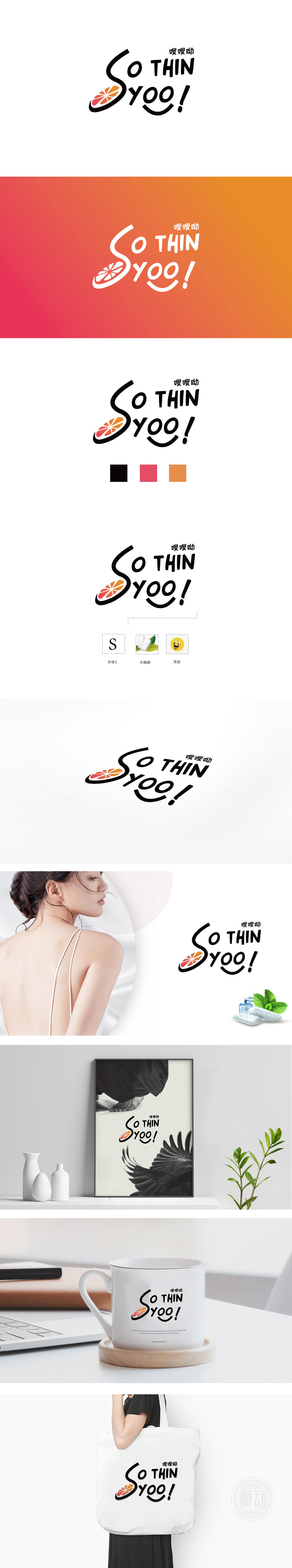
狮动设计将首字母“S”被设计为一条流畅、上扬的曲线,形似身体线条的轻盈感,暗合“瘦身”过程中形态的变化,用视觉语言直观呼应“THIN”的核心诉求。S的左下角嵌入了一片抽象化的“水果切片”图形(橙红色渐变+放射状纹理),既暗示产品可能与天然食材,为“瘦身”主题增添“天然、健康”的联想,传递出“轻盈享瘦”的积极调性。橙红色水果图形则注入温暖、活力的视觉焦点,同时橙红色常与“健康、天然、能量”相关联,符合瘦身产品对“安全无负担”的心理暗示。通过线条、色彩、符号的隐喻组合,让“瘦身”概念变得含蓄而有记忆点。S形的动态、水果的天然感、字体的情绪张力,共同构建了“健康、轻松、高效”的品牌形象。
Lion Design designs the initial letter "S" as a smooth and upward curve, which is similar to the lightness of body lines, coincides with the morphological changes in the process of slimming, and intuitively echoes the core appeal of "THIN" with visual language. An abstract "fruit slice" figure (orange-red gradient+radial texture) is embedded in the lower left corner of S, which not only implies that the product may be associated with natural ingredients, adding "natural and healthy" association to the theme of "slimming" and conveying the positive tonality of "lightness and thinness". Orange-red fruit graphics inject warm and energetic visual focus, and at the same time, orange-red is often associated with "health.


扫码或拨打添加客服微信


