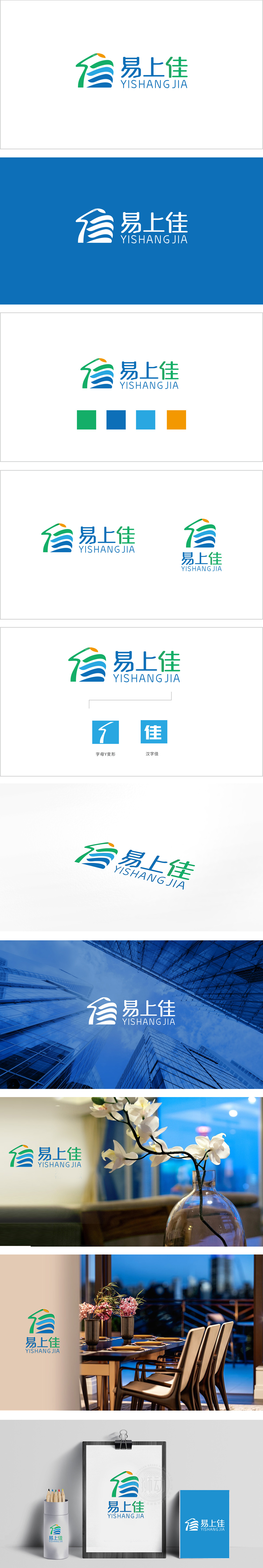
狮动设计以抽象化的“房屋”轮廓为基底,同时融入了向上延伸的箭头趋势传递安全与向上生长的行业属性,又传递出“品质升级、价值增长”的行业诉求——这一设计精准抓住了购房者对“家”的安全感与对资产增值的双重期待。蓝绿色波浪线条模拟了“水纹”或“大地”意象,既象征房地产与“土地”“自然”的紧密关联,也通过流动感弱化了行业的厚重感,增添了“宜居、和谐”的品牌温度,冷暖平衡,构建“专业可靠+自然宜居”的双重认知。
Lion design is based on the abstract "house" outline, and at the same time, it incorporates the upward arrow trend to convey the industry attributes of safety and upward growth, and also conveys the industry demands of "quality upgrading and value growth"-this design accurately captures the buyers' sense of security for "home" and their double expectations for asset appreciation. Blue-green wavy lines simulate the image of "water pattern" or "earth", which not only symbolizes the close relationship between real estate and "land" and "nature", but also weakens the heavy feeling of the industry through the sense of mobility.


扫码或拨打添加客服微信


