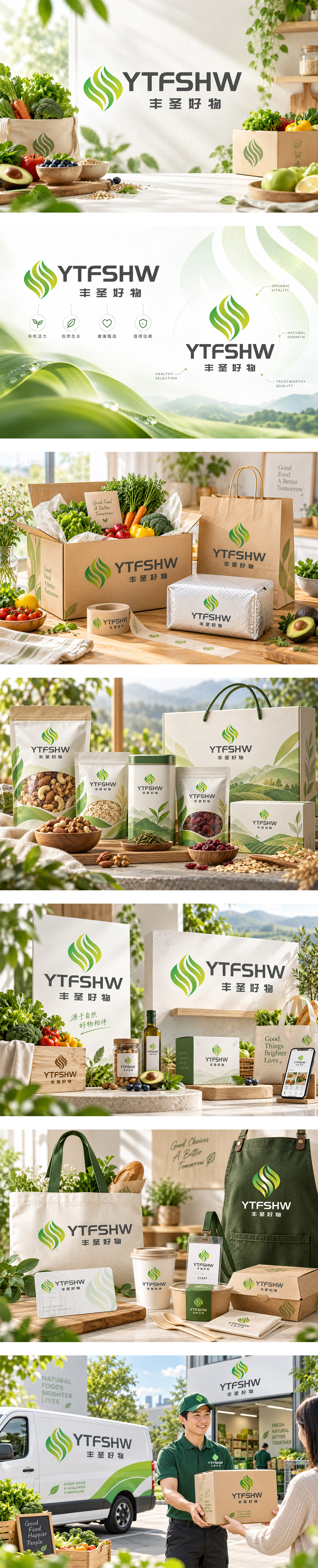
标志以层叠叶脉/萌芽为形,青绿渐变如光合律动,象征自然生长、有机纯净与鲜活能量。对称弧线向上舒展,暗含丰收丰盈与品质升华;灰黑字标沉稳现代,平衡电商品牌的信赖感与效率。整体传递“丰圣好物”从源产地到餐桌的健康承诺,构建有温度、可信赖的有机生活消费入口。
Layered leaf-like curves in fresh green gradients suggest photosynthesis, organic purity and vital growth. The upward symmetrical form implies abundance, quality elevation and nature’s rhythm. Solid gray wordmarks anchor the identity with modern reliability and e-commerce efficiency. The mark expresses a healthy marketplace promise—from origin to table—inviting conscious consumers into a trusted, vibrant organic lifestyle.




扫码或拨打添加客服微信


