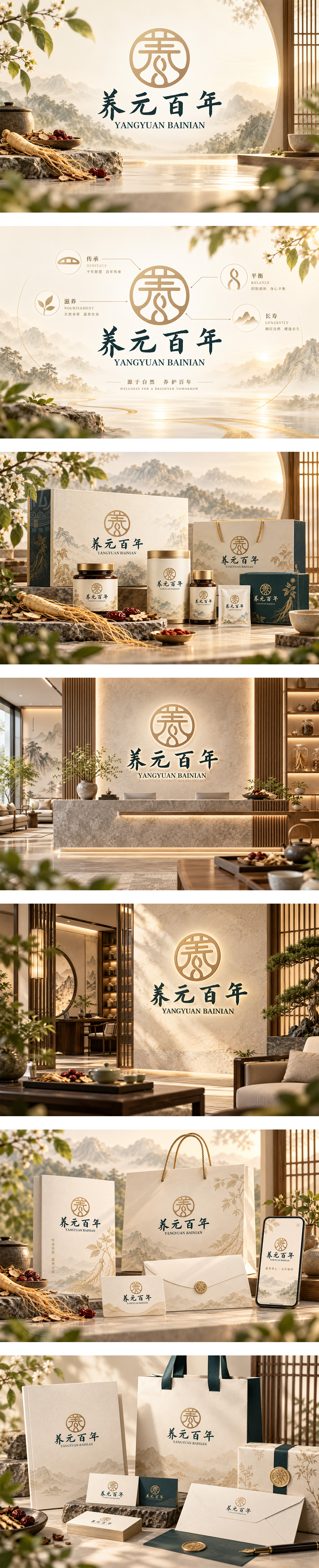
标志以圆玺为形,内嵌“养”字与生命根脉意象,上下贯通如气息流转,承续东方养生智慧。暖金色调温润典雅,喻自然精华与岁月沉淀;书法字“养元百年”笔力沉稳,传递固本培元、长效安康的品牌信念。整体庄重而平和,彰显大健康产品源于传统、臻于平衡的内养之道。
The circular seal encloses a stylized wellness glyph with root-like vitality, suggesting continuous energy flow and Eastern holistic wisdom. Warm gold conveys natural essence, timeless value and gentle nourishment. Calligraphic wordmarks ground the identity with strength and serenity, expressing foundational balance and long-term vitality. The design reflects a heritage-inspired health brand dedicated to inner harmony, preventive care and enduring wellbeing.




扫码或拨打添加客服微信


