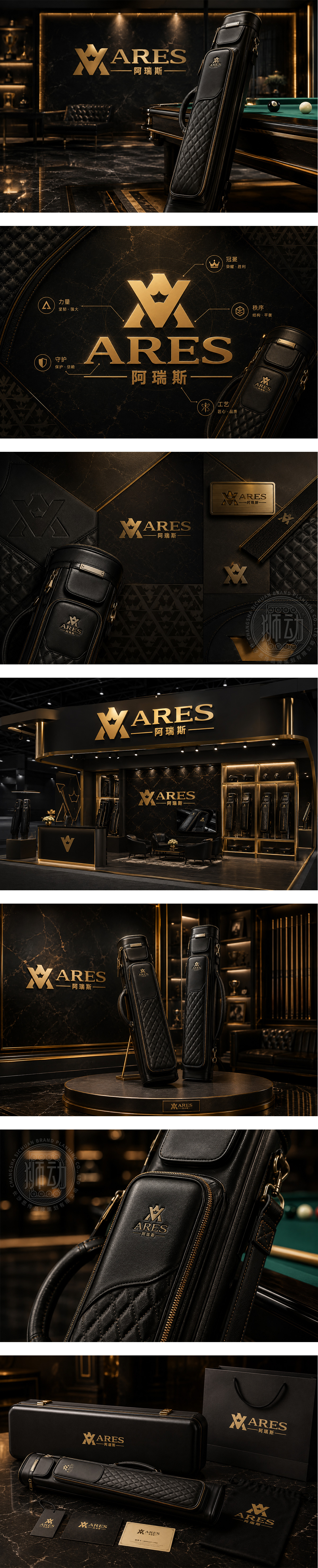
标志以“A”构筑盾形与皇冠意象,金色渐变质感映射台球运动的精准、掌控与王者气场;几何结构暗合球杆挺拔姿态与出击稳定度,传递高端装备的工艺自信。字标沉稳开阔,整体塑造专注竞技、优雅有力的品牌形象,契合专业台球杆包的品质定位。
The monogram builds “A” into a shield crowned with regal presence, its golden gradient echoing precision, command and the champion mindset of billiards. Geometric lines mirror the cue’s upright stance and steady strike, signaling craftsmanship and performance. Bold serif typography adds timeless weight, shaping a premium, competitive and elegant identity for professional cue cases.




扫码或拨打添加客服微信


