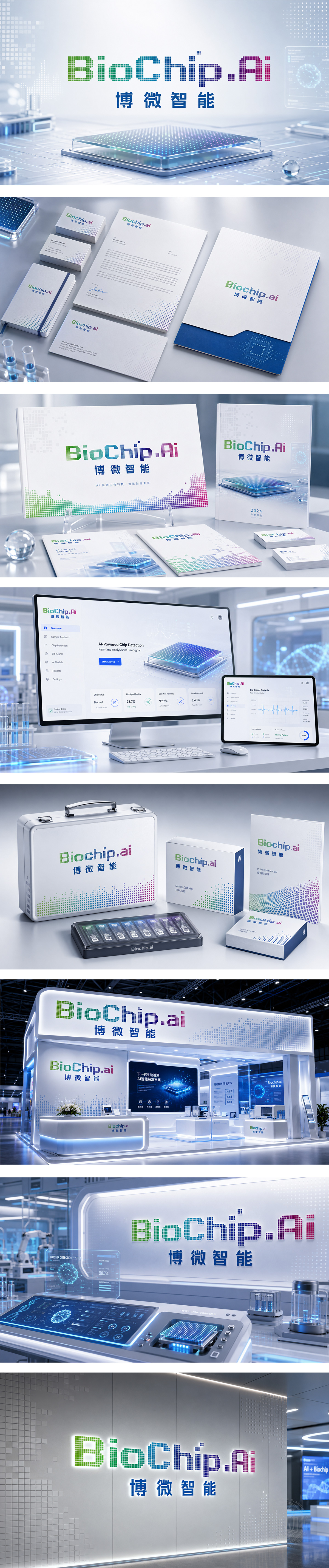
狮动设计采用了独特的像素点阵(或方块)字体设计。每一个字母都由细小的方块组成,这直接呼应了“Chip”(芯片)的集成电路特征,这种数字化的字体风格,天然带有科技感和数据感,完美契合了“.Ai”(人工智能)的后缀,暗示了该品牌利用大数据、算法来驱动生物芯片技术的核心逻辑。随着字母向后延伸,颜色逐渐过渡到青色、蓝色,最后“.Ai”部分变成了紫红色。蓝色代表理性、科技和芯片技术;紫红色则通常代表未来感、创新和智慧。
Lion design adopts a unique pixel dot matrix (or square) font design. Each letter is composed of tiny squares, which directly echoes the integrated circuit characteristics of "Chip". This digital font style naturally has a sense of technology and data, which perfectly fits the suffix of ".Ai" (artificial intelligence), suggesting that the brand uses big data and algorithms to drive the core logic of biochip technology. As the letters extend backwards, the colors gradually transition to cyan and blue, and finally the ".Ai" part becomes purple. Blue represents rationality, technology and chip technology; Purple usually represents futurism, innovation and wisdom.




扫码或拨打添加客服微信


